Transaction Banking App Design
tl;dr
Client
A leading transaction banking software provider (name confidential).
Role
UX Design Consultant (Globant, India) with Milind Sonavane, a Visual Design Consultant.
Ecosystem Mapping • Interviews • Information Architecture • Wireframing • Prototyping (HTML/CSS & Adobe Fireworks)
Timeframe
December 2012 – March 2013
Brief
To develop a mobile application for enterprise transaction banking, targeted at both iOS and Android smartphones and tablets for managing transactions on the go.
A linked goal was to evaluate the relevance and business viability of such an application for enterprise customers.
Outcome
We designed and developed a responsive prototype using the Bootstrap framework to showcase one of the app's core modules on smartphones and tablets to evaluate its business viability.
Based on the positive reactions and feedback that the app prototype received, I created detailed responsive design mockups, click-through prototypes, and design specifications for the entire application. At this stage, a visual language and detailed visual design mockups were also created by Milind Sonavane.
Brief
Responsive re-design of an enterprise transaction banking application for ‘on-the-go’ access on smartphones and tablets.
Enterprise transaction banking solutions track and record financial transactions, such as invoices and payments, in an enterprise context. They form a critical part of any business, and it is not unusual for banks to provide dedicated portals to their high volume enterprise customers.
A leading transaction banking software company approached Globant to design an app-based solution that could increase the reach and engagement of their existing web-based offering. Users could potentially approve, reject or edit transactions in batches or access specific transactions on the go and receive payments faster using camera-based OCR techniques.
What I did
Project Management
Milestone Planning
Collaboration
Communication
Consistent Handoffs (for UI/backend development)
Strategy
Product Ecosystem
Product Concept
MVP Concept Pitch
Design
Information Architecture
Simplified User Flows
Interaction strategy
Detailed wireframes
Prototypes
Role: UX design consultant (Globant, India)
I worked on this project with Milind Sonavane, a Visual Design Consultant. I was the primary contact point for the client on the project.
Core Challenge
Evaluating demand and viability by prototyping the minimum viable product
In 2012, the idea of a mobile enterprise transaction banking solution was still very new and seemed like a risky proposition for the company. Therefore, the company’s product and marketing team wanted to test and evaluate the application design concept with potential clients before developing it fully. We faced two challenges – translating the existing web application to a mobile phone app and prototyping the minimum viable product design concept so that the marketing team could test it with their clients.
Approach
Approach: Prototype Driven Design
Prototype-Driven Design
Ecosystem Mapping
The design of the application started with intensive domain and ecosystem review sessions with the client. As a part of this process, I also undertook a review of the existing product UI and interactions. Throughout this stage of the process, I worked closely with the product management and marketing teams to understand the application’s modules and consumer touch-points. I used this information to map the different information clusters within the application and the logical relationship and hierarchy between them in the form of an ecosystem diagram.
01/
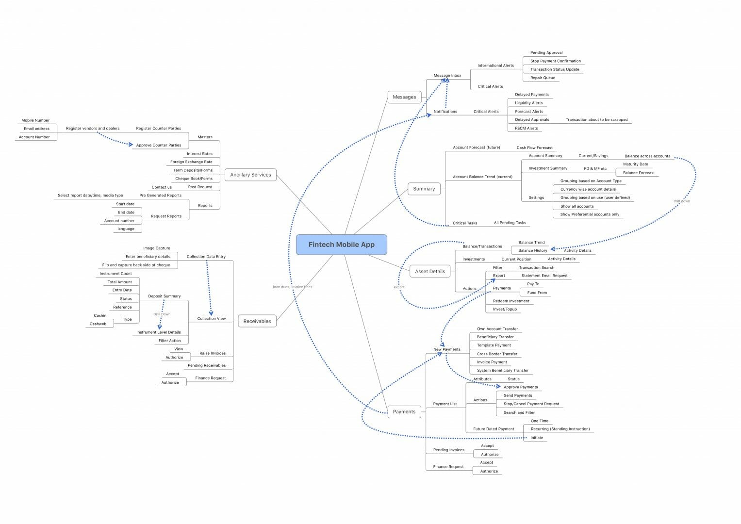
Ecosystem diagram for the transaction banking platform
Our client was a solutions provider for banks who planned to deploy and configure the solution for their enterprise customers. Hence, there was a significant degree of separation between me and the actual end-users of the software. So, I decided to focus on identifying key user-profiles and their tasks through extensive client interviews. This step was foundational for the whole process since it helped us collectively make informed decisions about the core features and data-points that would be important in a mobile context.
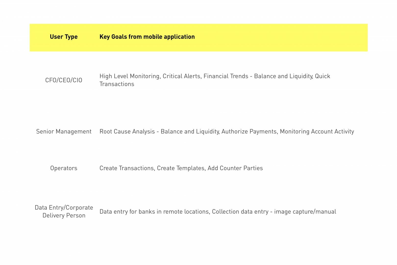
Key user profiles
Task flows
In addition to the ecosystem and the user profiles, understanding the task flows of the existing desktop application was critical. They highlighted existing workflows and information models that users were comfortable with. It also presented redundant and complex flows that could be eliminated while rethinking the application for a mobile context.
I realized that the interface would need to account for data scalability and data precision while also retaining a sense of familiarity that the desktop users had with the existing software. I used a modified version of the visual vocabulary proposed by Jesse James Garrett to model the task flows. I modified the elements of the vocabulary to segregate chunks of information from global and page-level actions.
02/
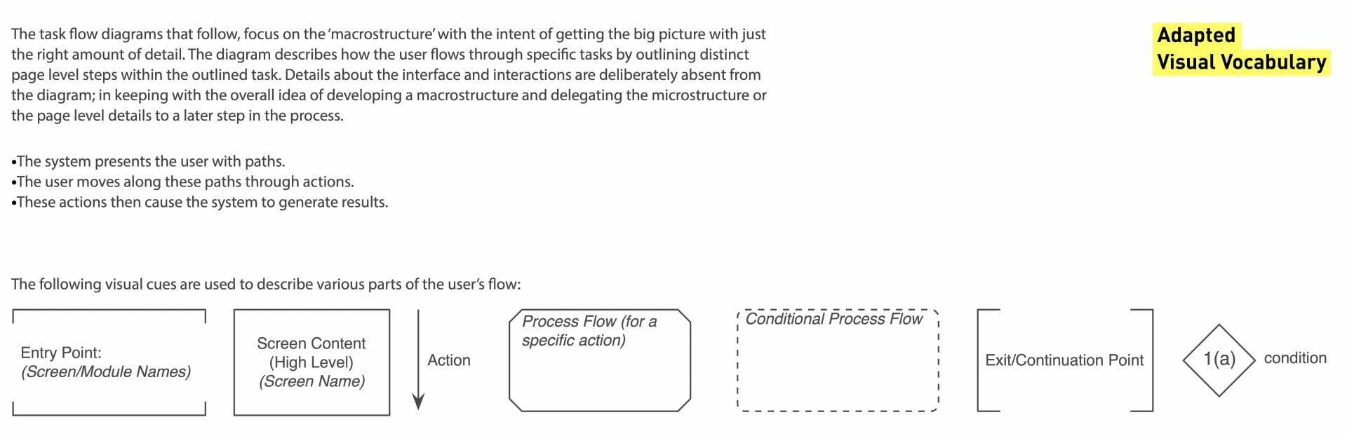
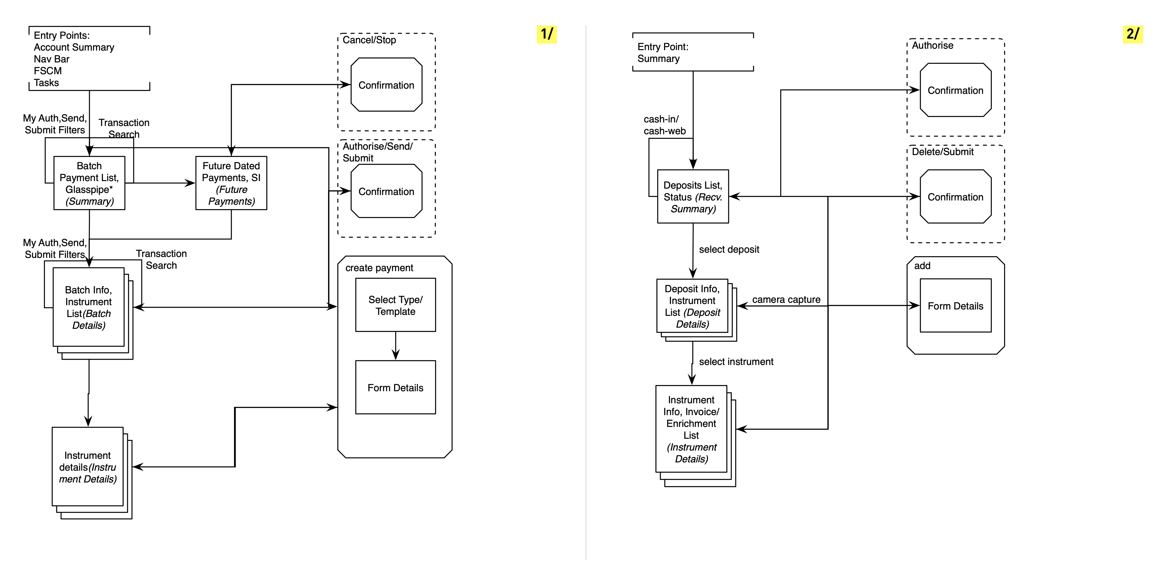
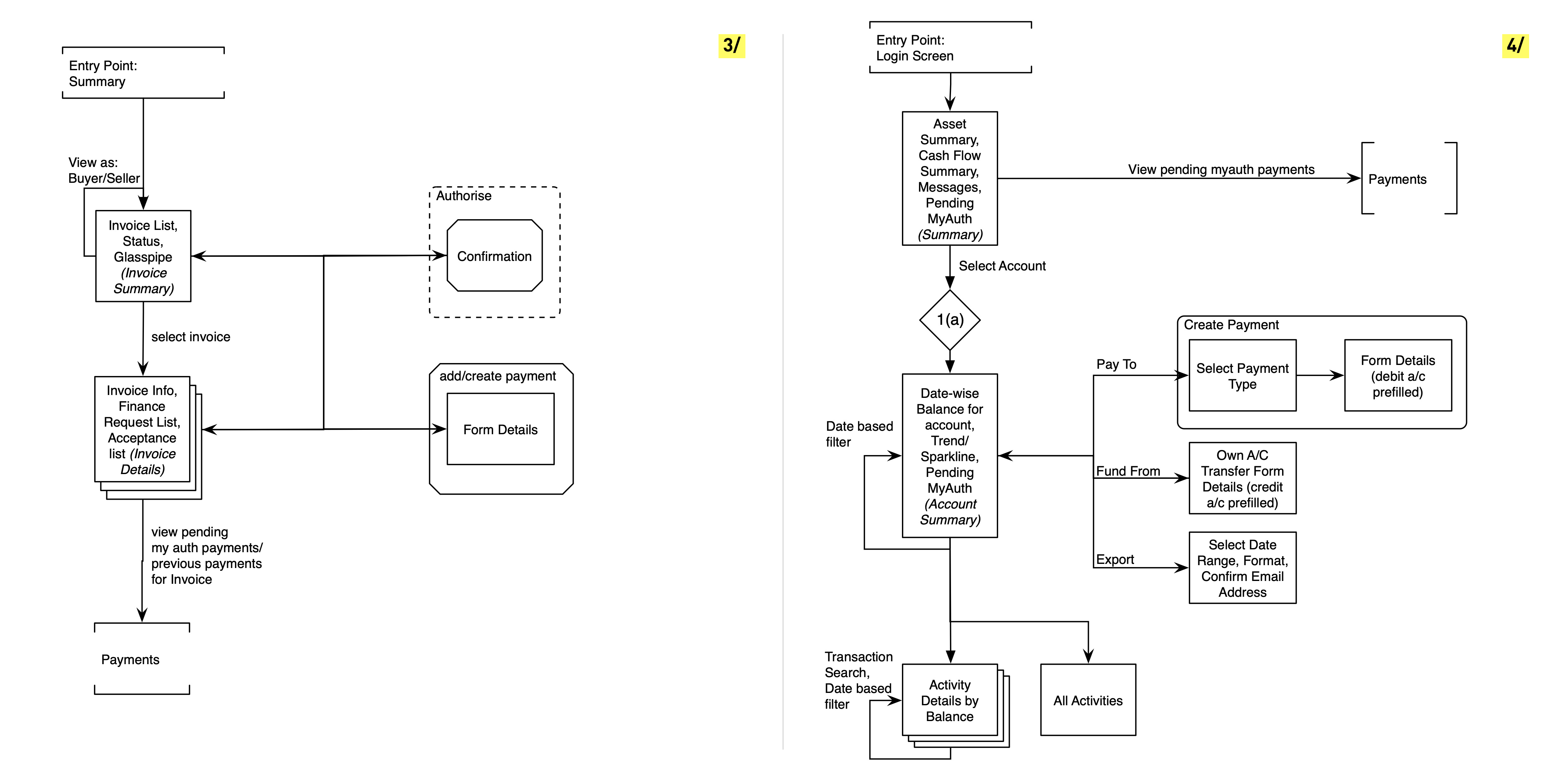
Screen flow diagrams – using an adapted version of the visual vocabulary by Jesse James Garrett
Responsive Sketching & Prototyping
At this stage, I started sketching out different concepts for the navigation and contextual actions. Thinking of the content and navigation paradigms mobile-first helps create agreement on content priority and clear navigation structures and is especially relevant in a data-heavy scenario like transaction banking.
Rather than create high fidelity wireframe concepts or even block level diagrams, I chose to do very quick and low fidelity concept sketches for identifying content scaling and navigation strategies. I sketched key screens for mobile and tablet devices using responsive sketch sheets. This helped me think through the information structure and interactions and how they would adapt to the device at hand. Final sets of sketches were discussed with the client and their feedback and concerns noted before the prototypes were created.
03/
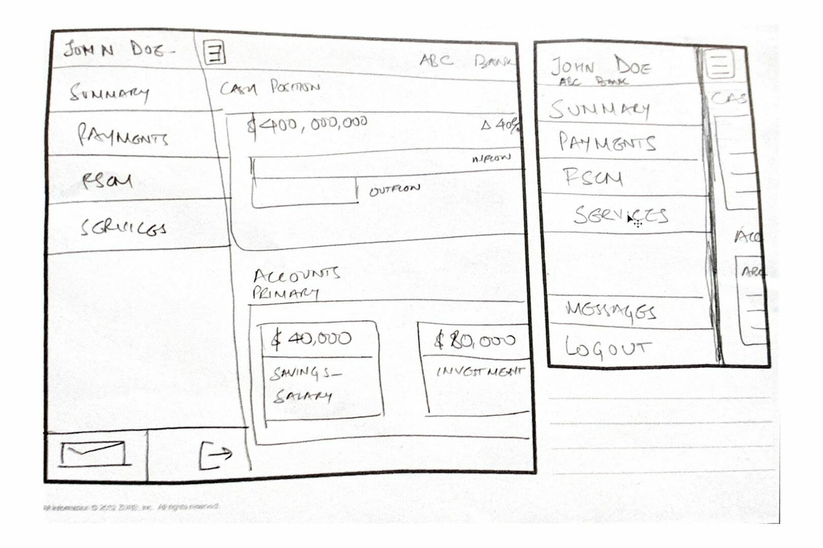
Responsive Sketches
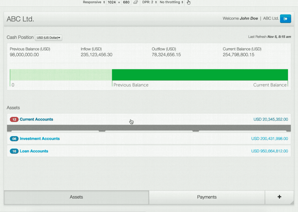
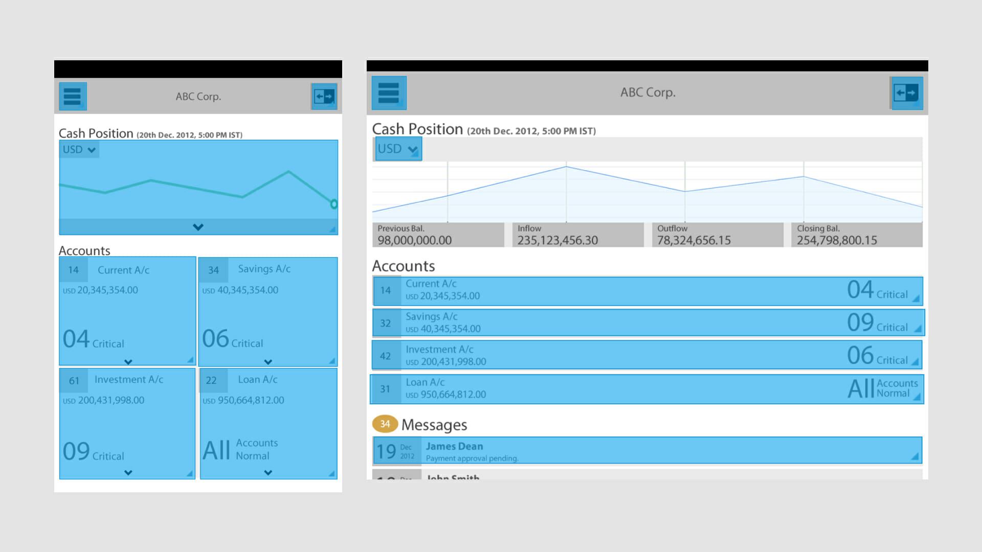
Based on the interaction and navigation strategy outlined in the sketches, I prototyped the key screens in the form of an interactive storyboard. This was done using the Bootstrap responsive web framework. Before the availability of prototyping platforms like Invision/Flinto/Framer, web frameworks like Bootstrap were useful to quickly mock up ideas without having to re-create common components and responsive layouts.
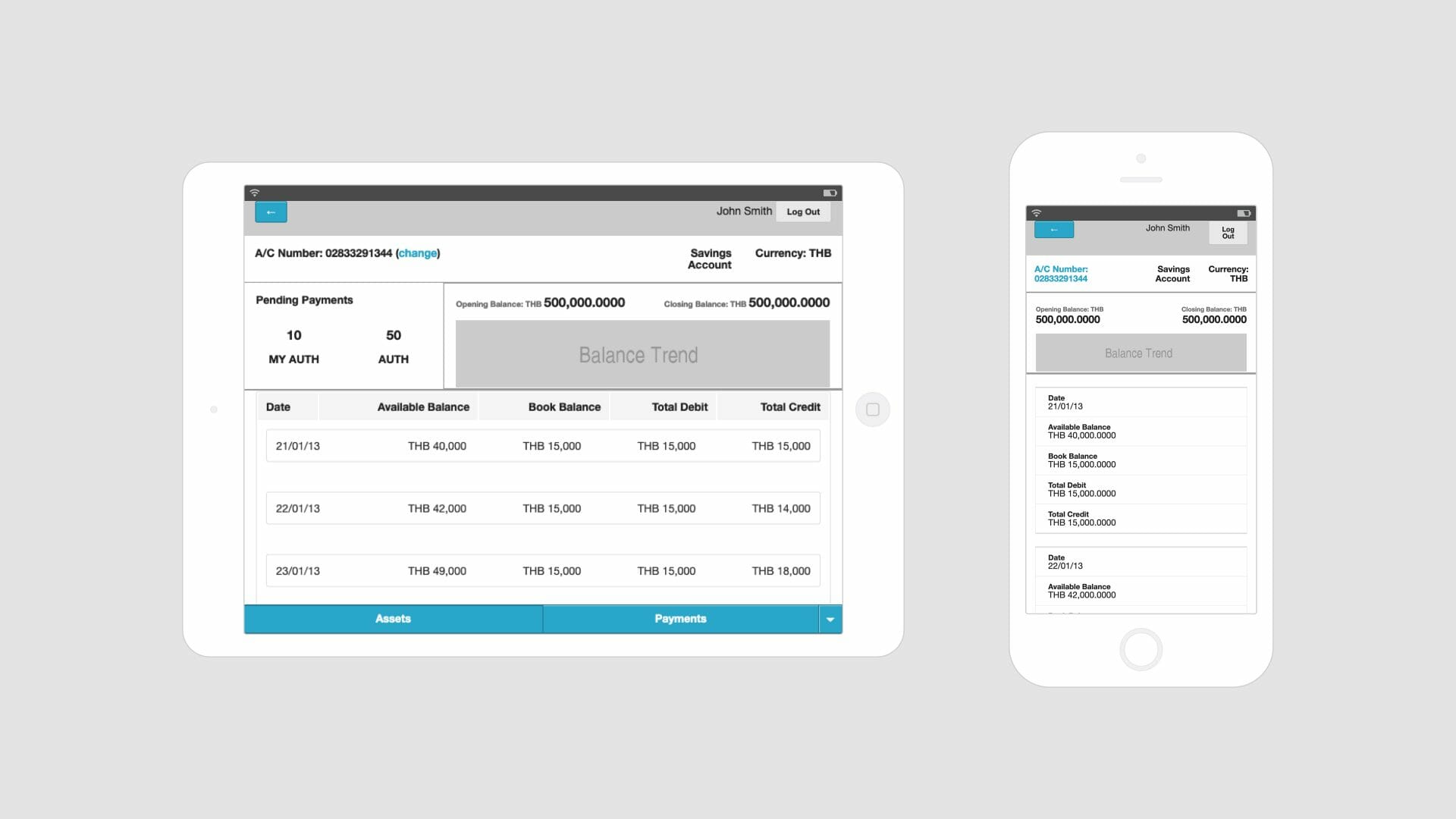
I also worked with my colleague Milind Sonavane, who was the visual designer on this project to ensure the HTML prototypes were presentable and visually consistent. However, we deliberately kept the screens minimally styled in the first phase to avoid implicitly suggesting a visual language at an early prototype stage itself.
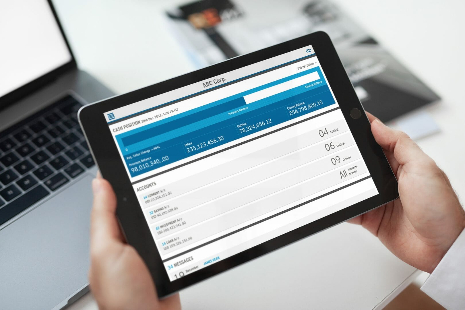
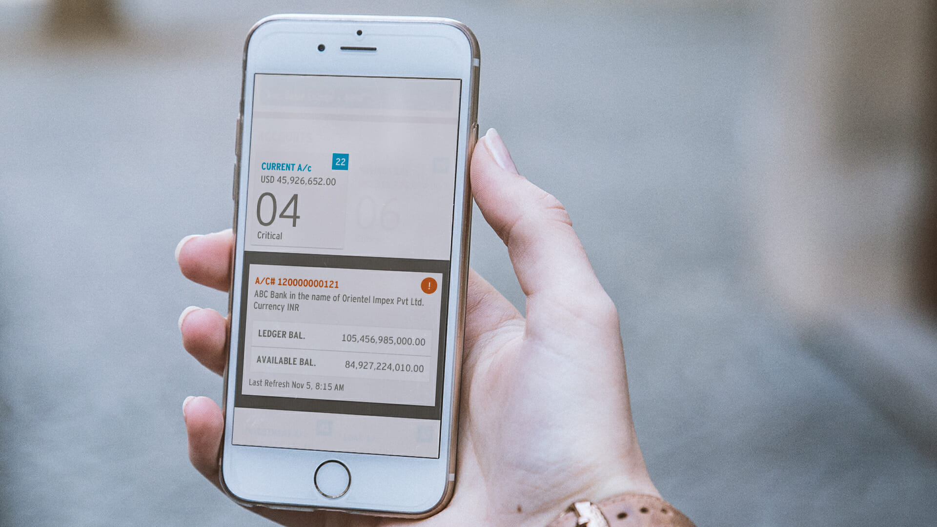
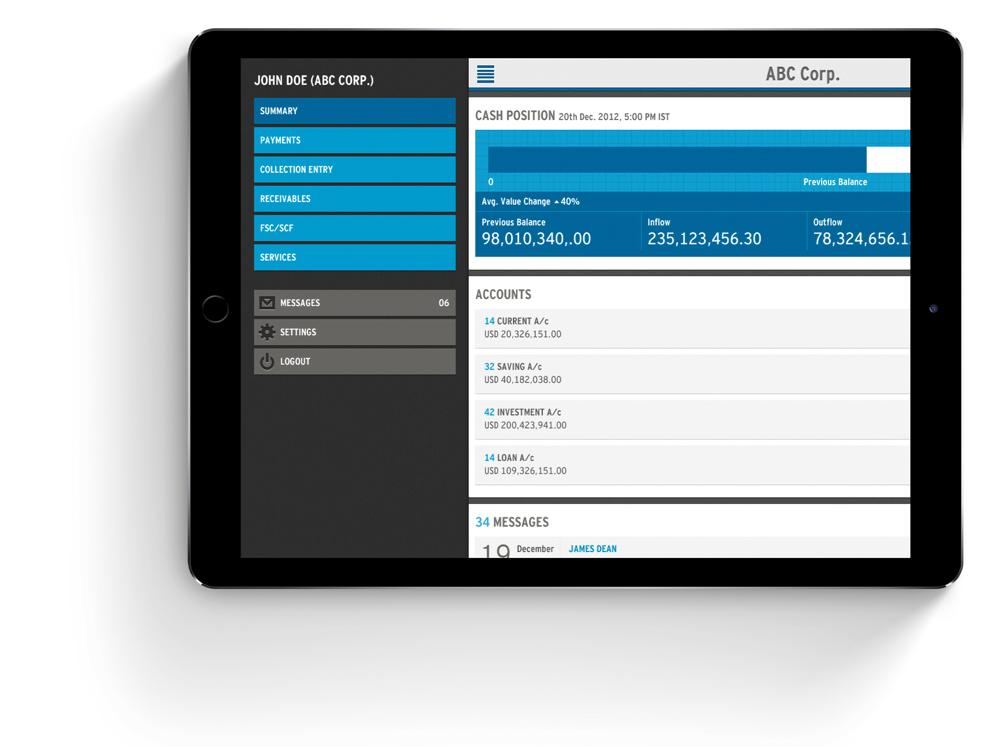
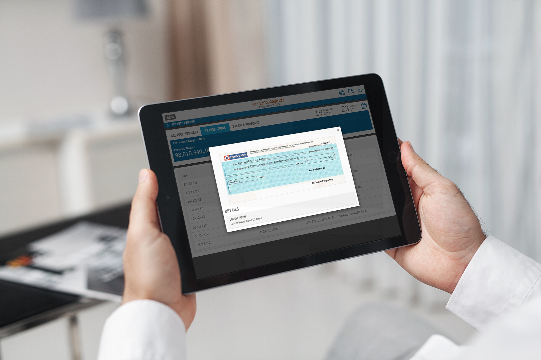
Storyboard prototypes were invaluable in demonstrating navigational and layout changes based on device types and helping test user flows and user interaction strategies early on. The prototypes used actual data points to test assumptions of data scalability and identifying constraints related to presenting and accommodating data on the interface. These prototypes were deployed on smartphone and tablet devices. Using HTML5/CSS3 features like device caching and mobile meta-tags, we were able to make the browser completely invisible and simulate an app-like experience. These prototypes were given to the client early on so they could share it with their customers and gather feedback and response for the application being designed.
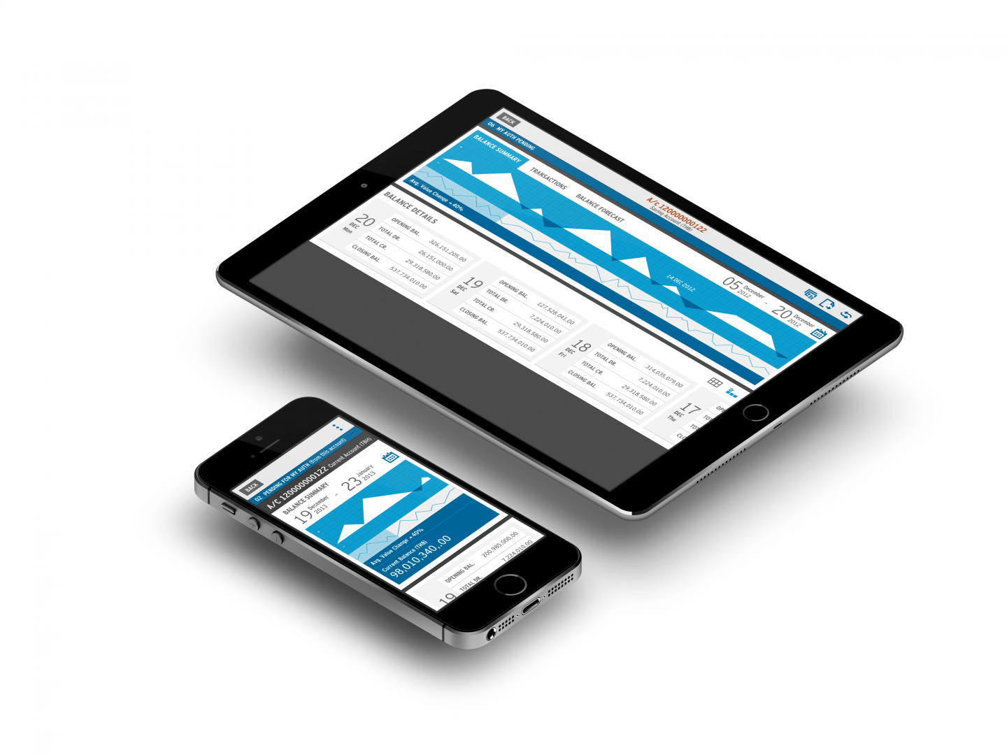
Final MVP app prototype – developed in collaboration with Milind Sonavane using the Bootstrap framework
Detailed Design
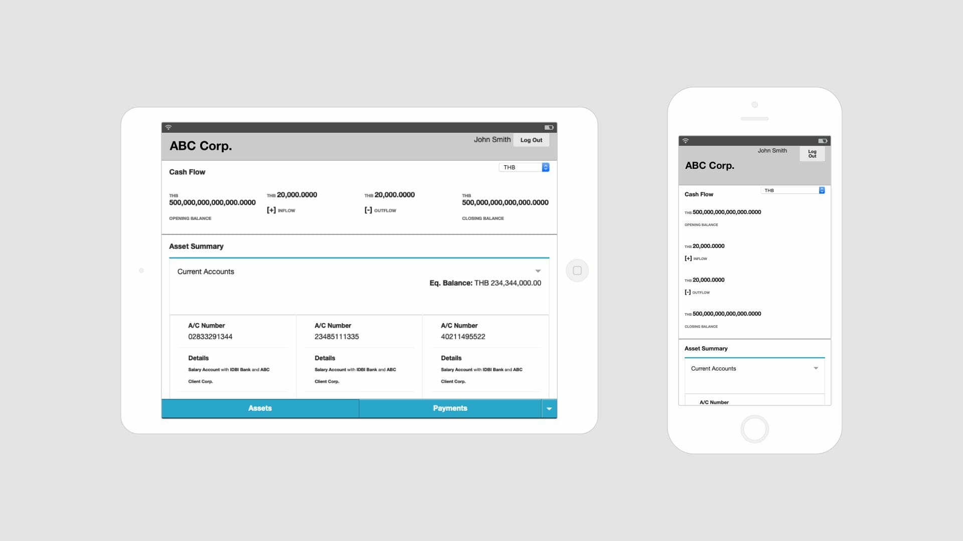
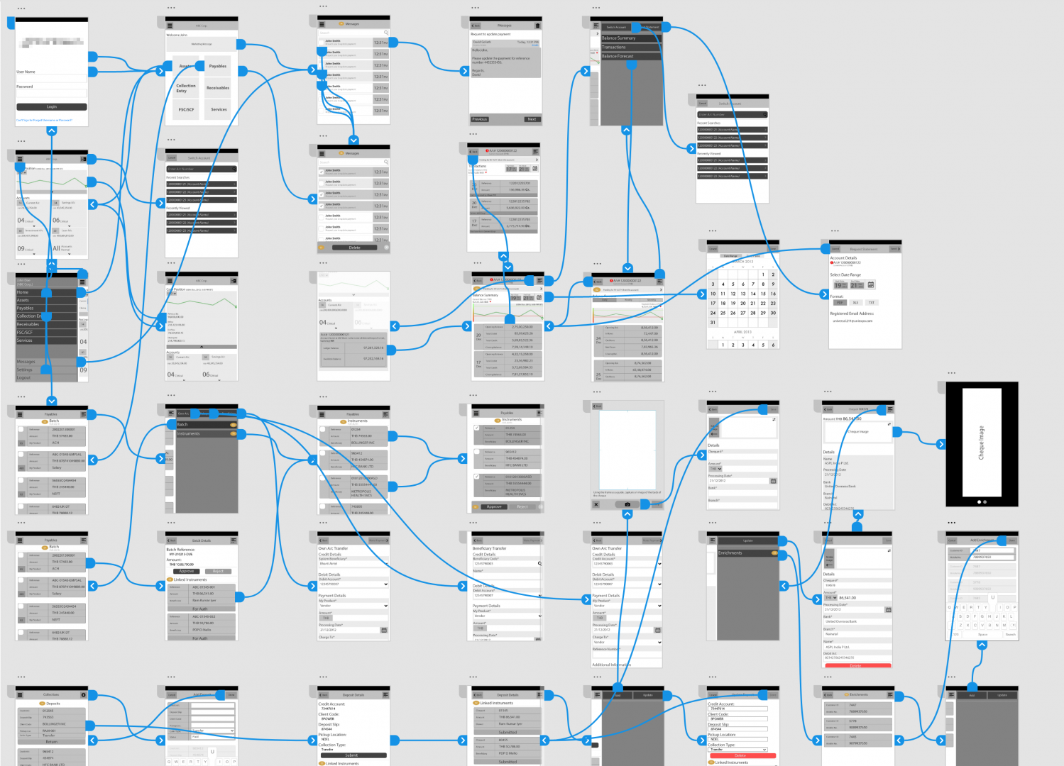
I created the detailed wireframe screens next, using the prototype storyboard as a reference point. I continued using the actual data points as a reference while designing these screens to identify possible breakpoints and constraints related to data display. The feedback and reflection from the prototype helped iron out issues with the interaction strategy and bring in an element of uniformity in the navigational paradigm. A uniform navigational paradigm helped reduce the learning curve involved with the interface and, in the case of responsive web design, helped UI developers in writing maintainable code.
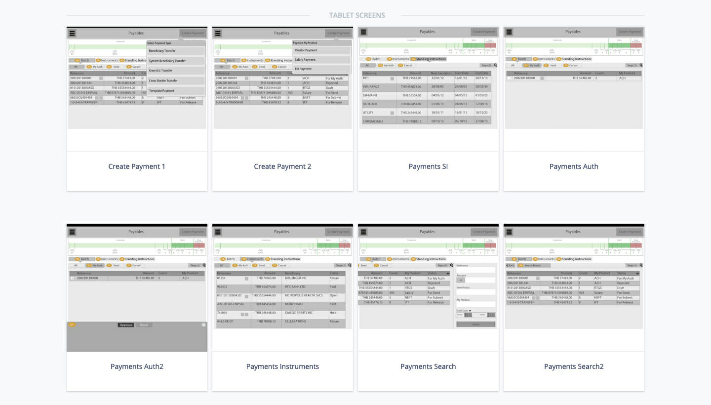
04/
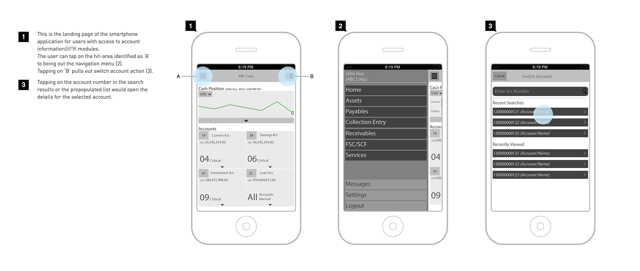
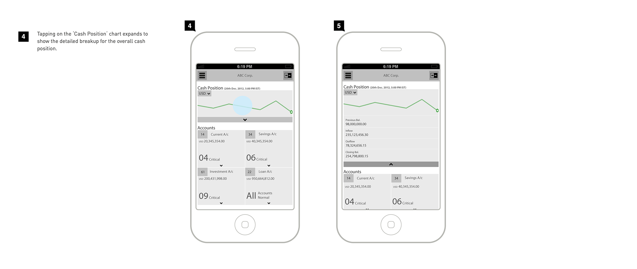
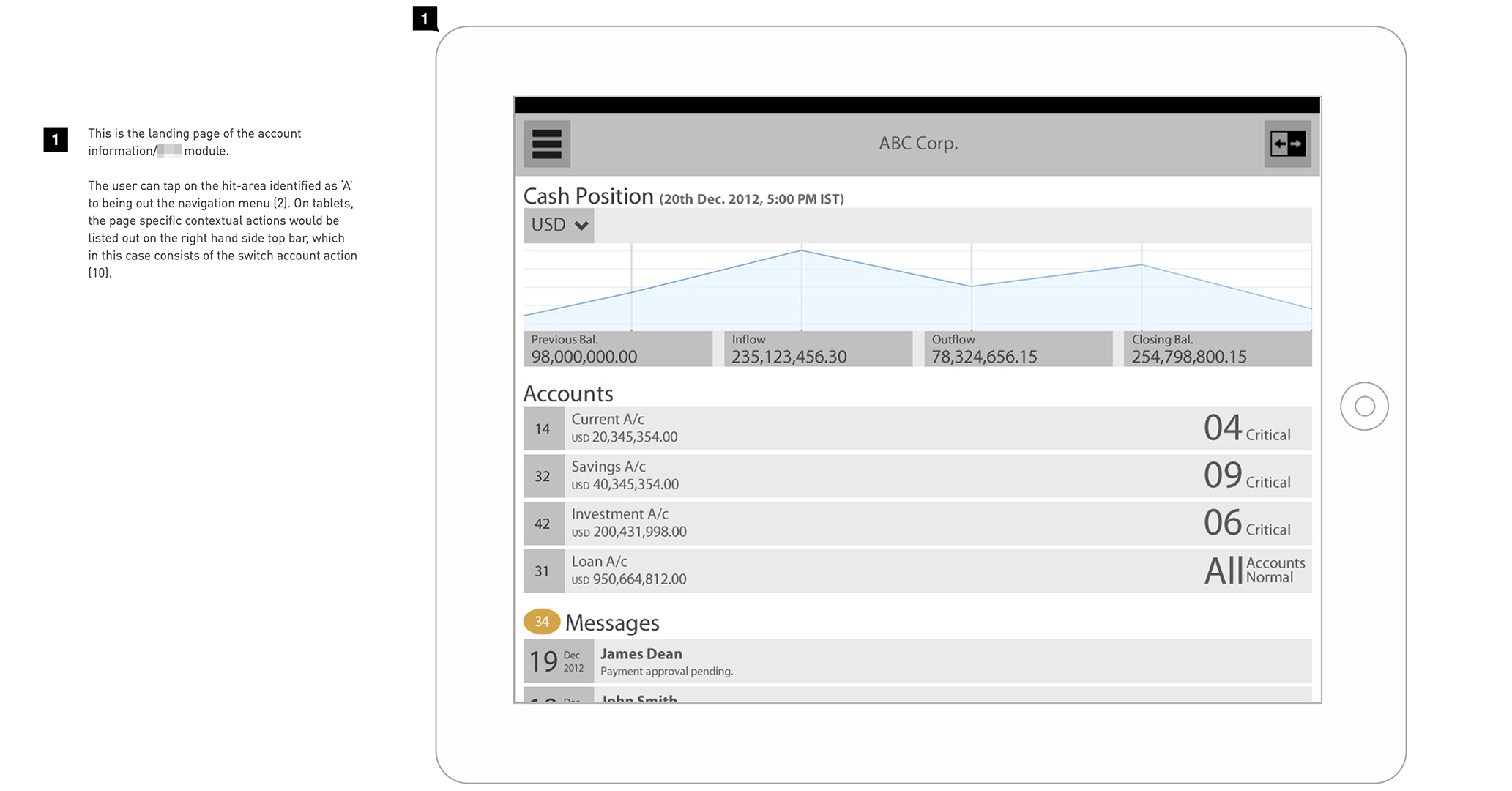
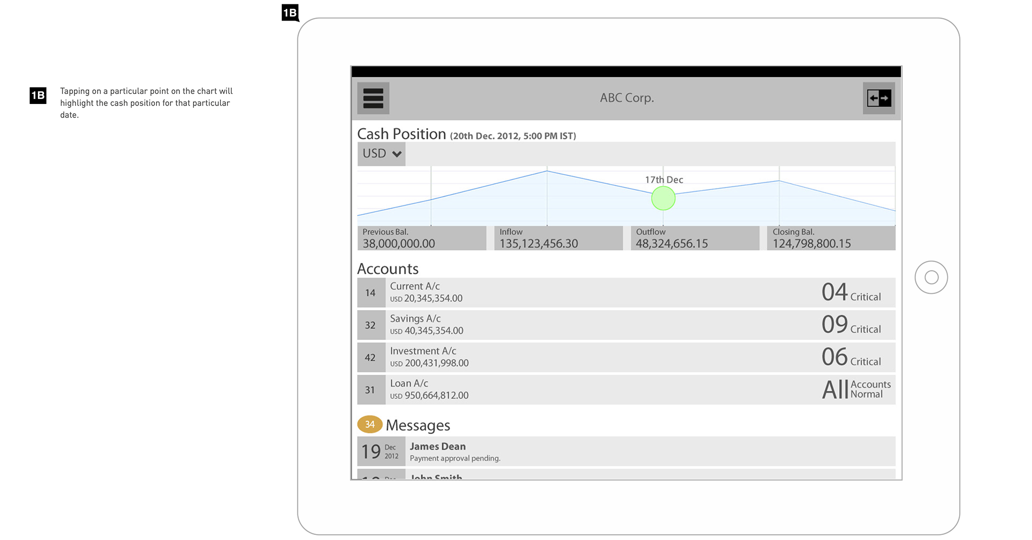
Wireframe mockups and detailed flow level documentation
Since motion and transition are one of the key guiding principles of screen movement in a mobile context, these need to be identified and communicated to the client and subsequently, the developers. So, I prototyped key flows and screen transitions using the Touch Application Prototype (TAP) library for Adobe Fireworks and shared them with the client and developers in the form of on-device demos. TAP allows designers to add gestures like swipe, pinch and tap and page transitions to wireframes using pre-defined tap targets and hotlinks.
Click through prototype demo of the mobile app design (originally created in Adobe Fireworks, recreated in Adobe XD)
Prototype Demo (Single Module)
Mobile app demo
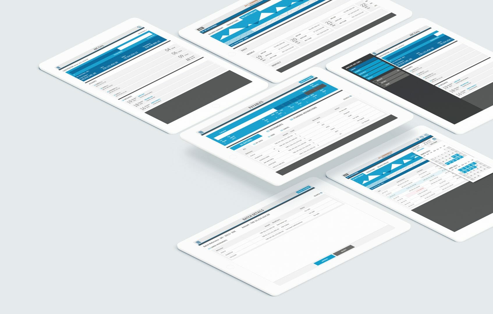
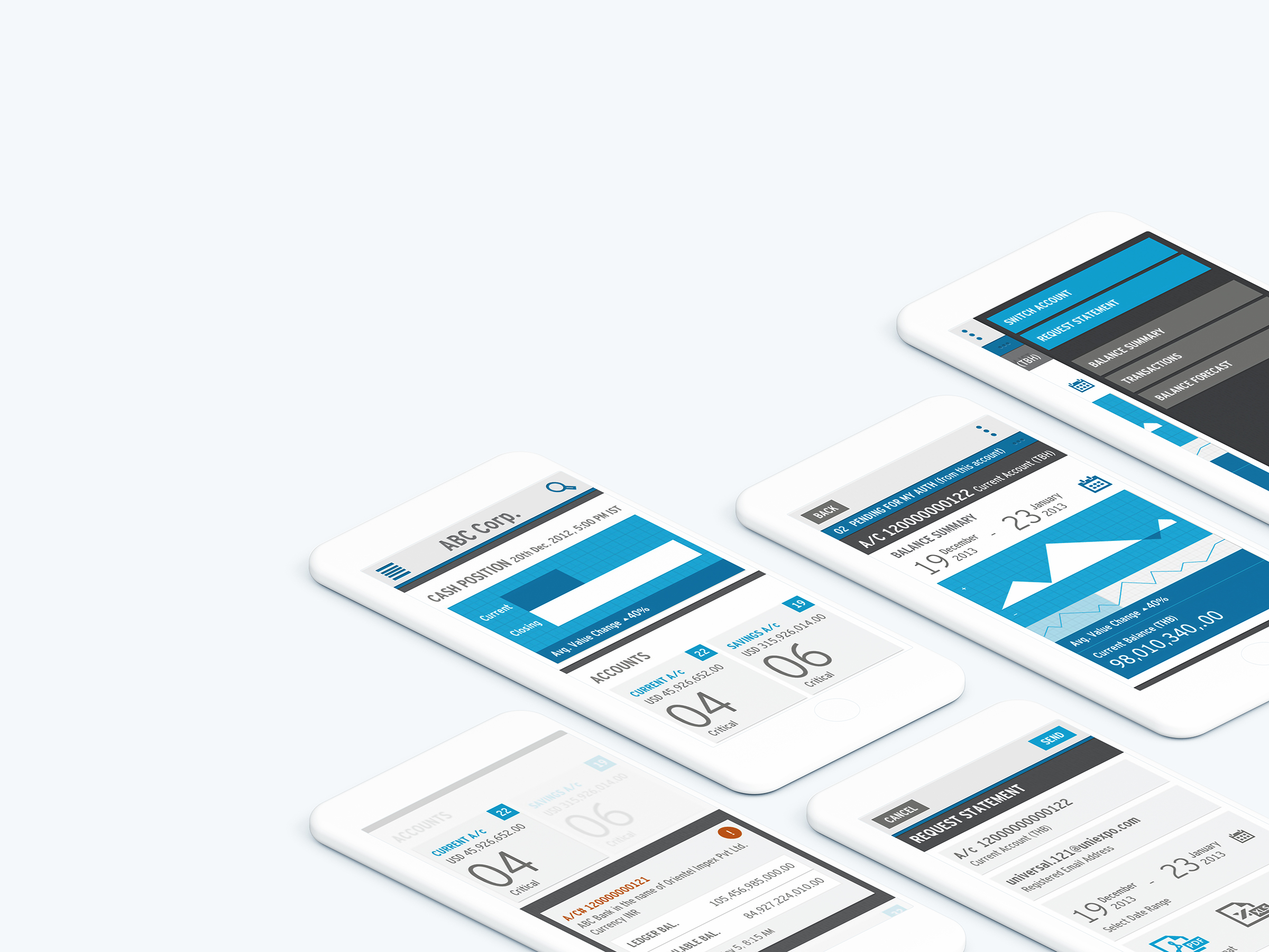
Snapshot of Detailed Wireframe screens
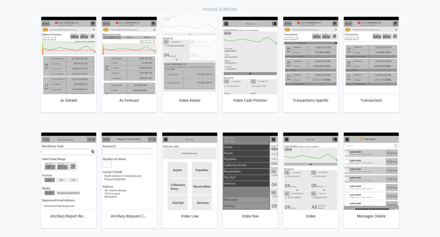
Wireframe mockups – mobile and tablet
Visual Design
The visual design language and pixel-perfect screens for this app were created by my colleague Milind Sonavane.
05/
Visual Mockups (created by Milind Sonavane)
Publication
I discussed the process and learnings from the project in a peer-reviewed industrial case study that was presented in the Asia-Pacific CHI conference in 2013 at Bangalore, India. I also conducted a series of hands-on workshops on Responsive design and prototyping with my colleague Milind Sonavane.
Research Paper
Pandey, S. (2013). Responsive Design for Transaction Banking—A Responsible Approach. Proceedings of the 11th Asia Pacific Conference on Computer Human Interaction, 291–295.
More Projects
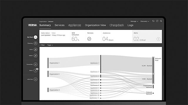
Software Defined Network Management ApplicationEnd-to-end design of a v1.0 product for a stealth mode startup (name confidential)
LibraryUXIntroducing and Positioning Design for the University of Oslo Library

FriluxBranding Design at the University of Oslo Library
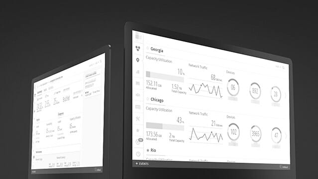
Enterprise Cloud Storage Management ApplicationRe-designing the application (name confidential) to seamlessly manage and monitor large-scale storage clusters
KuluWellness tracking app for teenagers with chronic health challenges
TibloDesigning an open-ended and tangible learning aid for young children with dyslexia
EyespyTVProbing smart surveillance through a portable TV and cultural probes
HearsayA voice-enabled lamp that is ‘always in conversation’
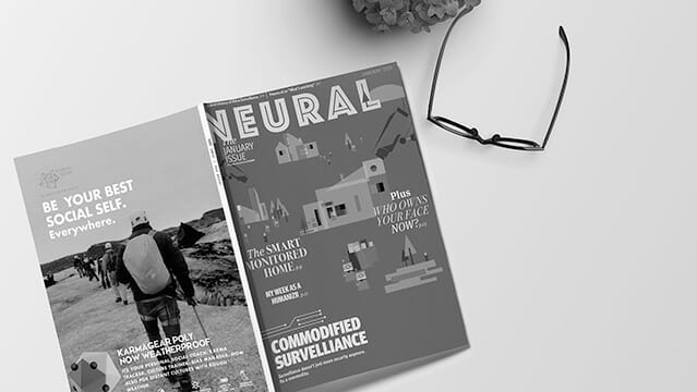
NeuralA fictional technology magazine from 2025
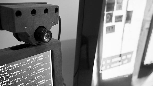
EyespyInteracting with Smart Surveillance