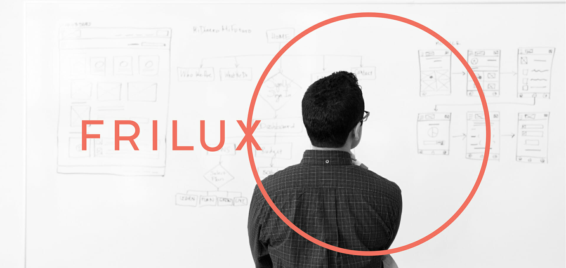
Frilux
tl;dr
Client
The University of Oslo Library & The National Library of Norway.
Role
Contracted design and research engagement. Collaborated with Sanjay Basavaraju, a brand and graphic designer.
Co-Design • Project Management & Co-ordination • Strategic Framing • Workbook Information Design • Workshop Design & Facilitation
Timeframe
September 2016 – June 2017
Brief
To frame design in strategically relevant and inclusive terms for the academic library at the University of Oslo.
Outcome
The project resulted in a brand called Frilux that strategically expresses design in the context of the library based on their values and work practices.
The brand consists of a visual identity, clearly articulated brand values, and touchpoints such as workshops (Flex) and seminars (Flo), a design workbook (the Flexbook), a website, and marketing collateral.
The Frilux visual identity
goals & background
Identify and communicate the values and vision underlying the design approach at the University of Oslo Library in an engaging way to Nordic academic libraries.
The main goal of this project was to help translate and communicate the value and significance of design (as perceived at the University of Oslo Library) to Nordic academic libraries in concrete, practice-based terms. Branding the design approach at the library helped frame and communicate it using the librarians’ own vocabulary.
So, it expressed what design meant and what its strategic role could be for libraries in terms that were familiar and inclusive for librarians. This meant that the brand (and therefore design) could become a part of the librarians’ everyday practices and vocabulary. Also, librarians could independently take ownership of the brand and develop and evolve it further. We approached the idea of a brand as a contextually relevant representation of ideas, vision, history, values, and goals, and not just a visual identity linked to a product, service, or business.
What I did
Project Management
Leadership
Scheduling
Collaboration
Critique
Communication
Strategy
Project Concept
Approach Evaluation
Workshop Format
Team Mentorship
Workshop Facilitation
Formulating Methods
Design
Information Design
Seminar Materials
Interviews
Toolkit testing
Role: Project Lead (Under Contract)
I worked on this project with Sanjay Basavaraju - a brand and graphic designer, and the core LibraryUX team (consisting of four senior staff members and the leadership of the digital services department).
Sanjay designed the brand and created the visual language of the touchpoints, while I was responsible for planning and leading the process, and the concept and information design for touchpoints such as the design workbook and the workshop and seminar.
The Frilux tagline
The Brand: Frilux
The name Frilux embodies the open outlook, playfulness, and free thinking that is at the core of the LibraryUX approach at the culture at the University of Oslo Library.
The name Frilux embodies the open outlook, playfulness, and free thinking that is at the core of the LibraryUX approach at the culture at the University of Oslo Library.
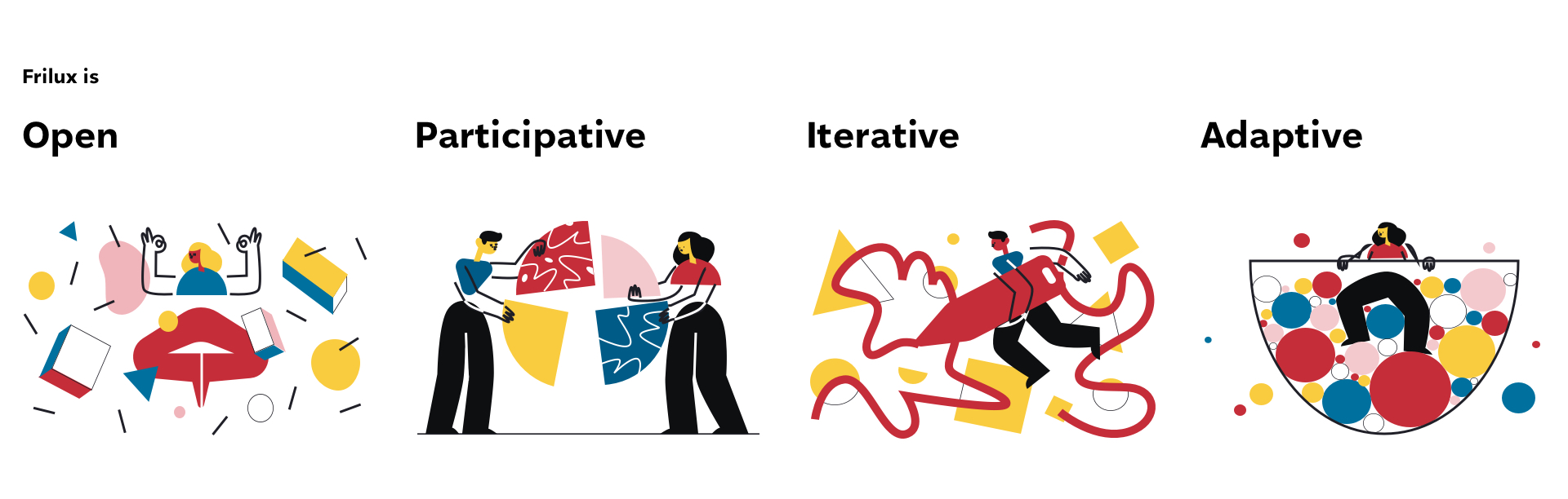
Frilux, represented an mix of the Nordic values of fri (free), adapted from friluft (free air, nature) and frilek (free play), with Library UX. The identity embodies openness, iteration, adaptability, and participatory values that represent the library and are at the heart of Nordic culture. These brand values were identified in collaboration with the library. The visual identity was designed by Sanjay Basavaraju to embody these values. The identity acts as a way to both represent and play with the brand.
Brand values
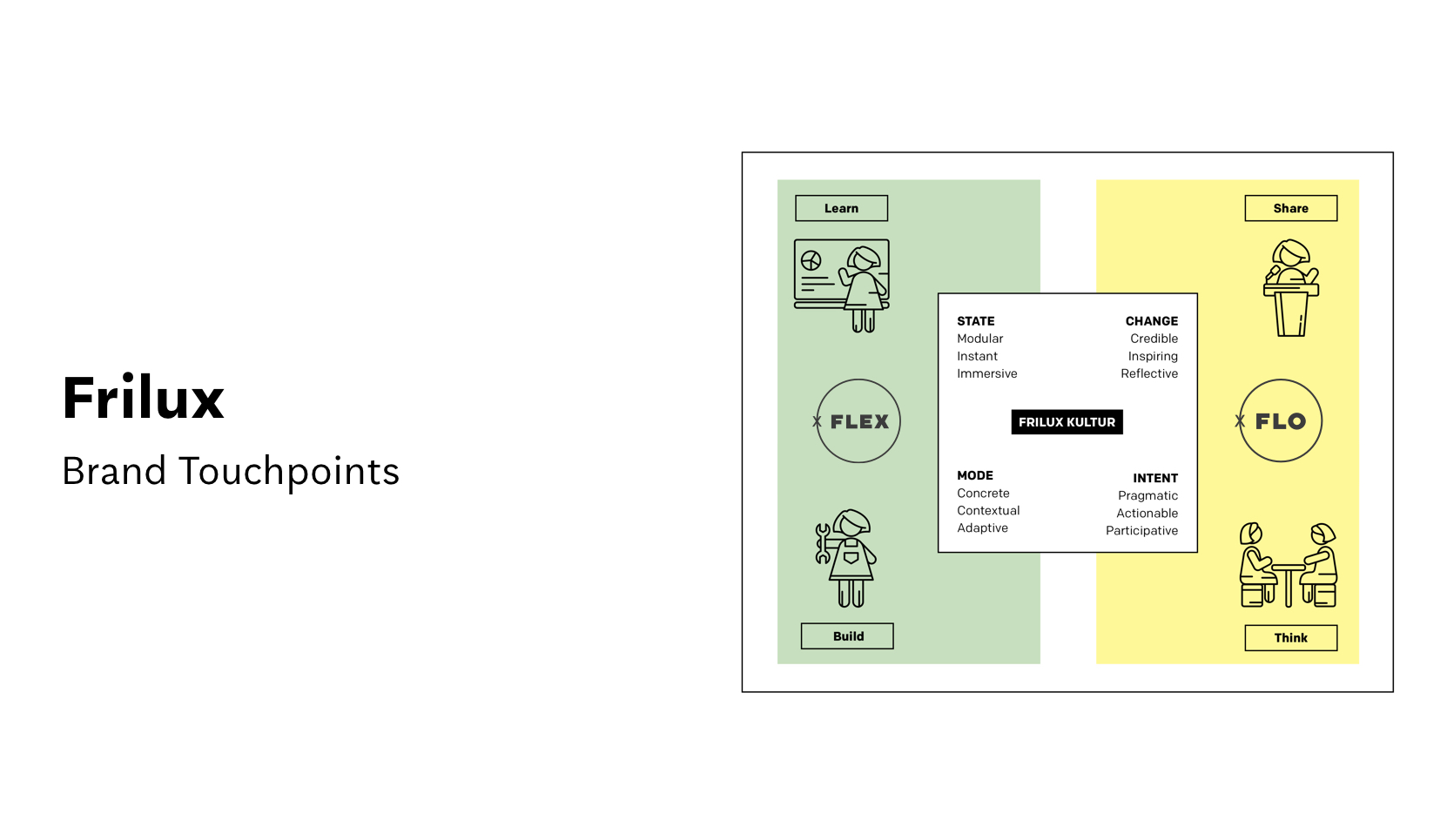
The brand architecture was defined in terms of two core elements:
- Flex, a platform and workshop series for learning and practicing design at the library.
- Flo, a seminar for sharing experiences, learning, and reflection related to design in libraries.
The intended effect was to organically develop a Frilux kultur (culture) and mind-set and eventually build a community or ‘network’ of libraries for sharing experiences and mutual learning. The architecture also situates the identified brand attributes that describe the cultural shift we were aiming for with Frilux.
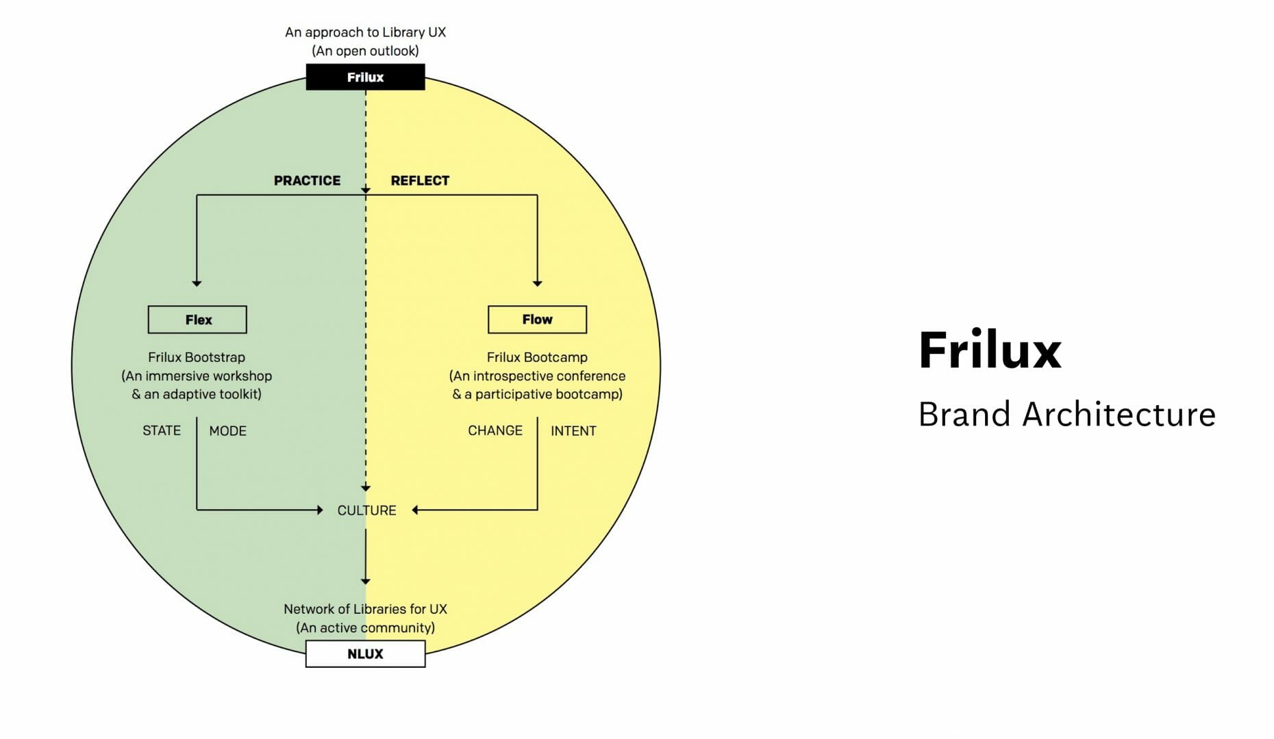
Brand Architecture
Frilux consists of different touchpoints such as brand values and architecture, visual identity and guidelines, a knowledge exchange forum (Flo), avenues, such as workshops for introducing design (Flex), a workbook for introducing, exploring, and adapting design methods (Flexbook), and social media channels and a website (frilux.no).
Together, these touchpoints express the values, strategy, vision, and approach for design at the library.
Brand touchpoints and visual communication
Approach
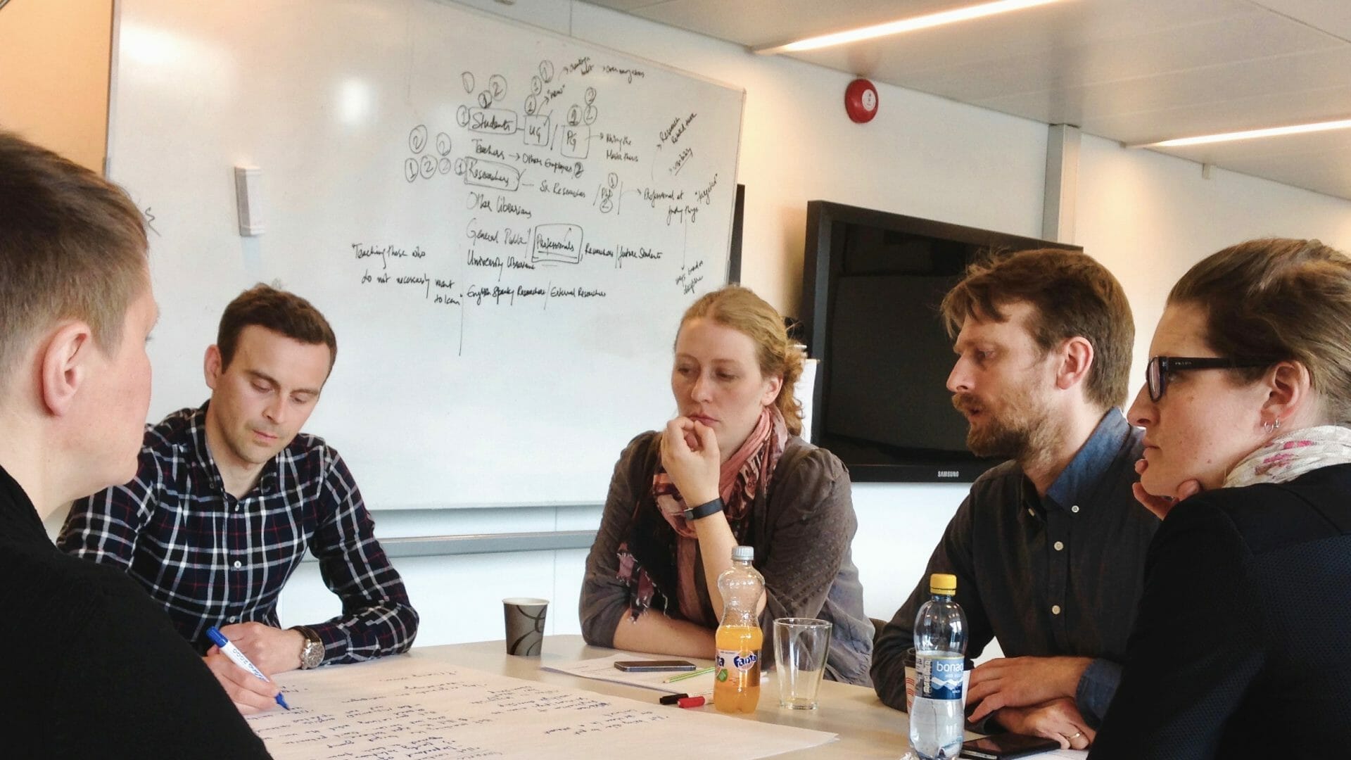
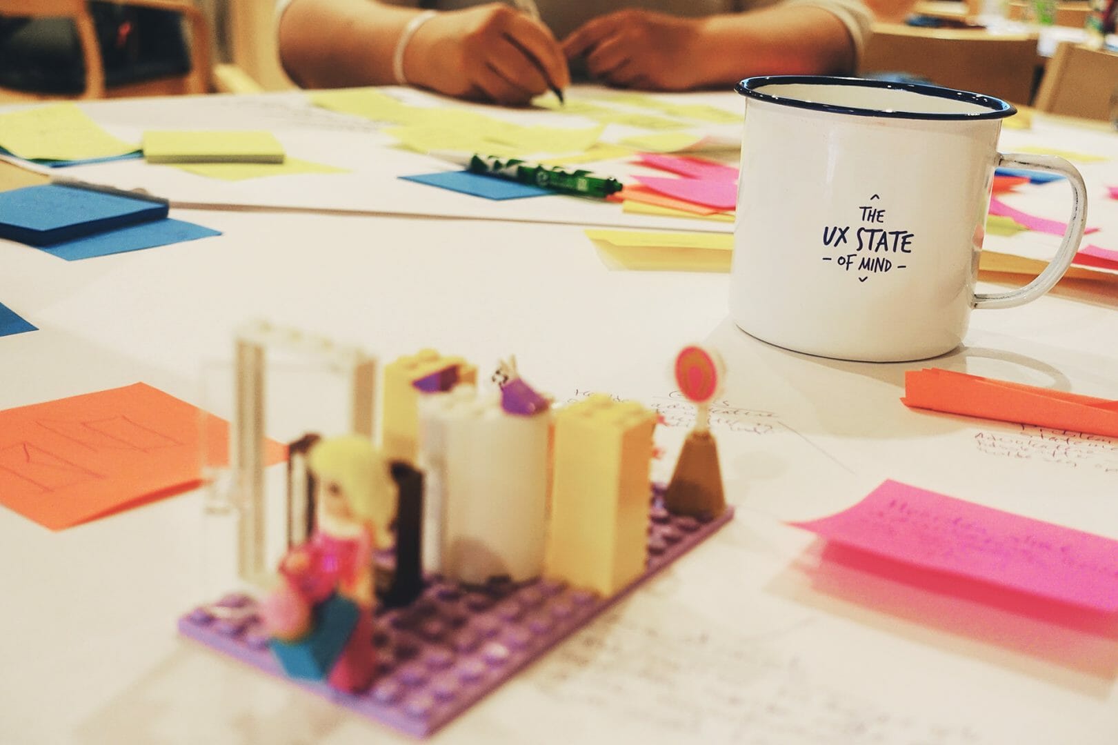
Discovery and Dialogue
We adopted a dialogic approach for this project. It meant that facilitating creative participation and ensuring constructive collaboration was an important part of my role in the project. At the same time, I also participated fully in the co-design workshops and discussions. I worked closely with the design expert, offering critique and feedback on unfinished and interim concepts and collaboratively sketching new ideas and alternatives with him, based on discussions in workshops with the team at the library.
To adopt a dialogic approach, design experts must learn to listen, but they must also learn to propose their own ideas and visions. And to do it in the most appropriate way.
– Ezio Manzini, Design Culture and Dialogic Design (2016)
developing A common understanding
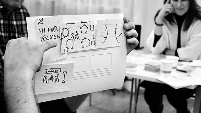
We began by collaboratively brainstorming questions/prompts such as – What do we want to achieve with the program?, in the context of the library’s broader goals and vision with the expert designer. This was meant to help discover and articulate the library’s values, perceptions, and strategic expectations and aspirations with regards to design. One of the highlighted goals were to develop:
01/
“Self-sustaining and continuously evolving methods. The core ideology of semi-structured exploration, participation, openness, appropriation, and improvisation should stay the same but should not be method/person dependent or specific.”
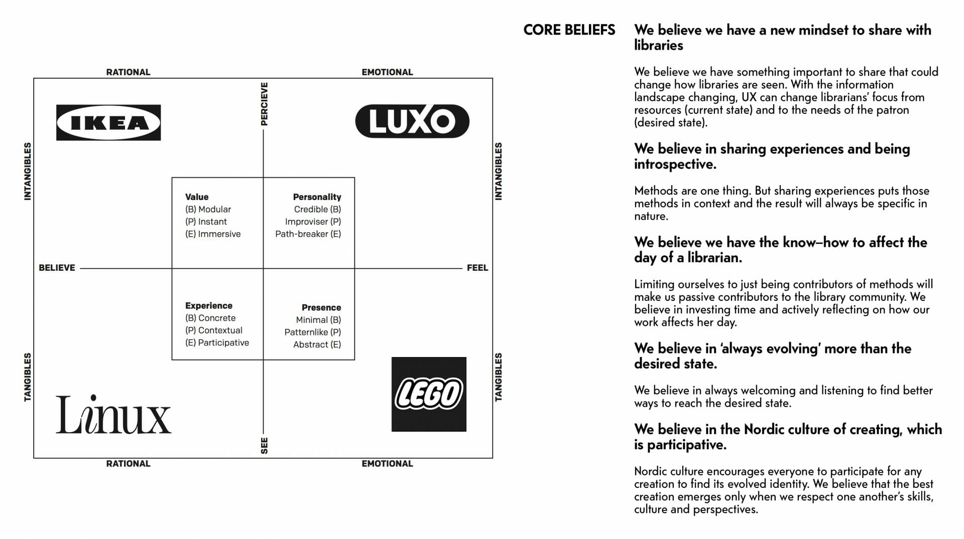
This document also served as a starting point for collaboratively identifying the brand attributes (the qualities that characterise a brand across its touchpoints), and brand values (the expectations and relevance of the brand).
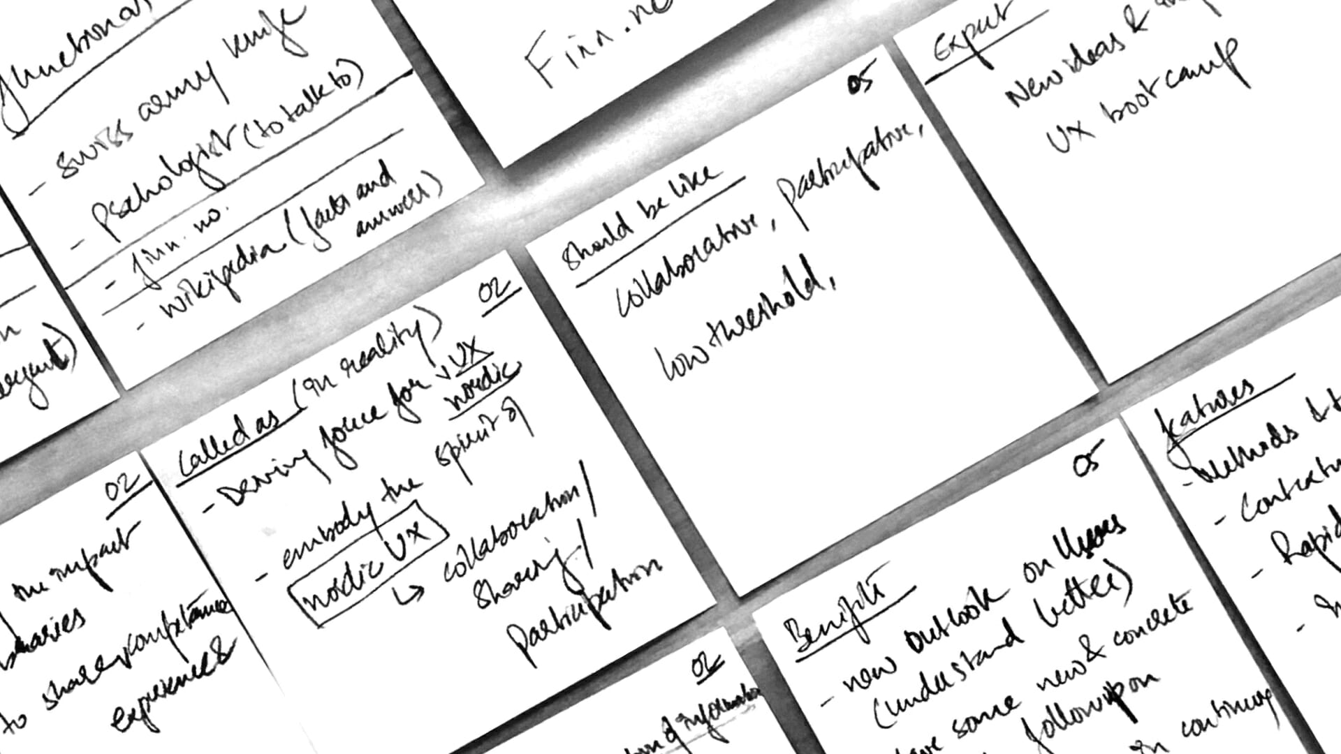
Outcomes from the initial workshops
Naming and Identity
Based on the identified brand values and attributes, we evaluated different proposals for the brand name and identity. At this stage, it became clear that the brand should not be framed in terms of a program or as a skill-oriented teaching platform, but instead highlight an open mind-set for mutual learning and sharing experiences.
Through successive cycles of co-creation and deliberation, we decided that the brand should embody the spirit of Nordic design both in its name and identity.
02/
“…we would not like to imply that we are here to teach others and certify, just share, initiate change and learn together.”
– Excerpt from the feedback document shared with the brand design expert
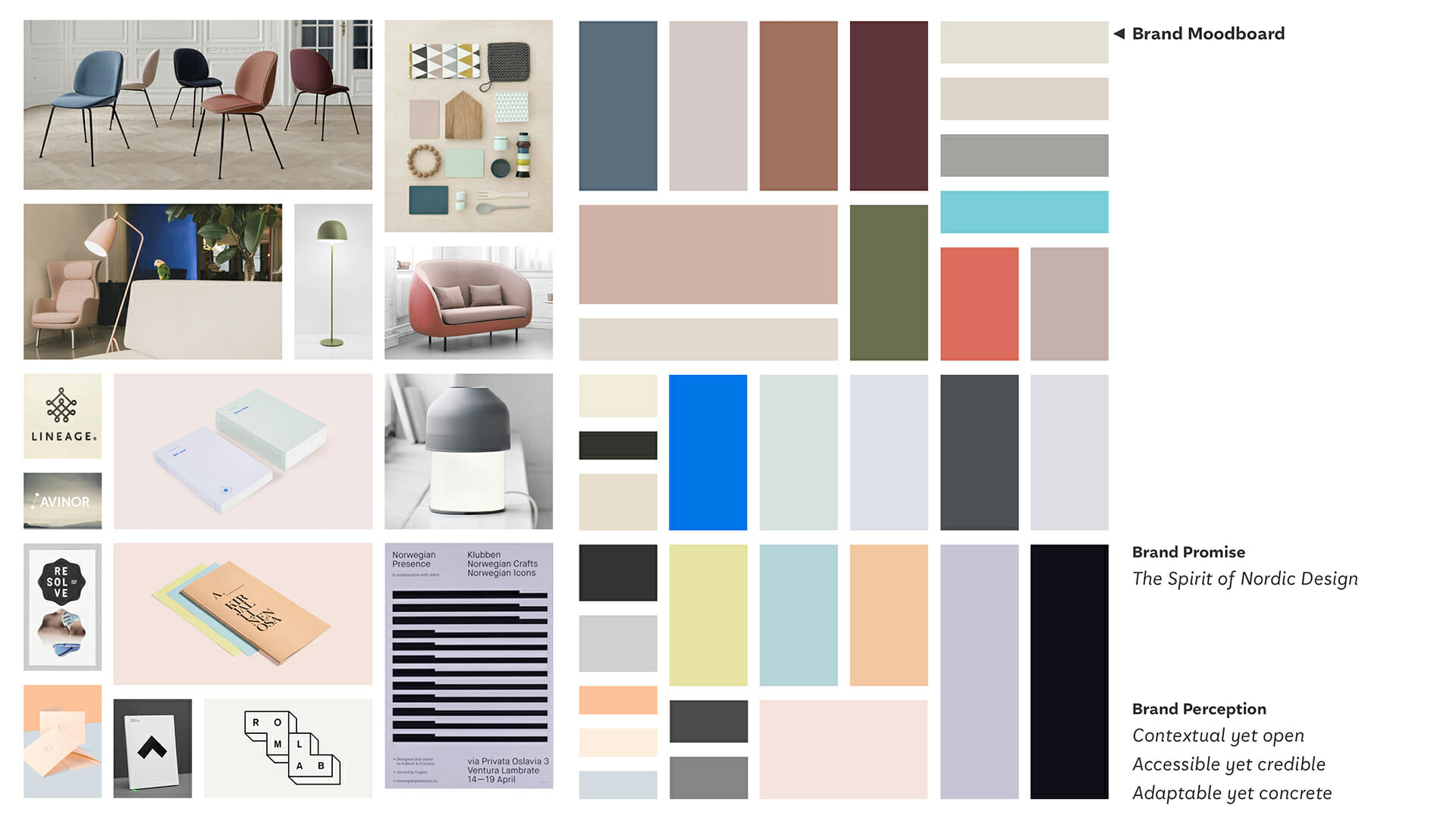
Moodboard
Touchpoints
The brand architecture served as a framework that guided the design of the brand’s touchpoints by helping define how we could operationalise the identified brand values in concrete terms.
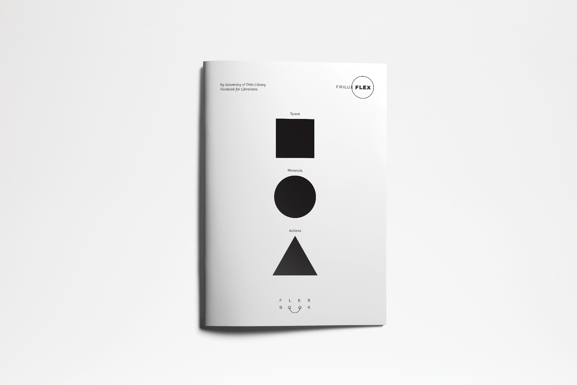
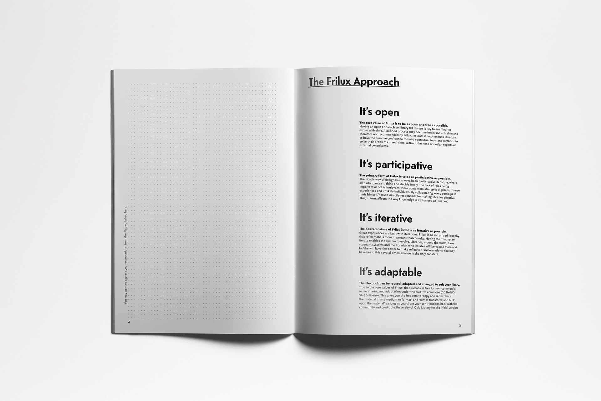
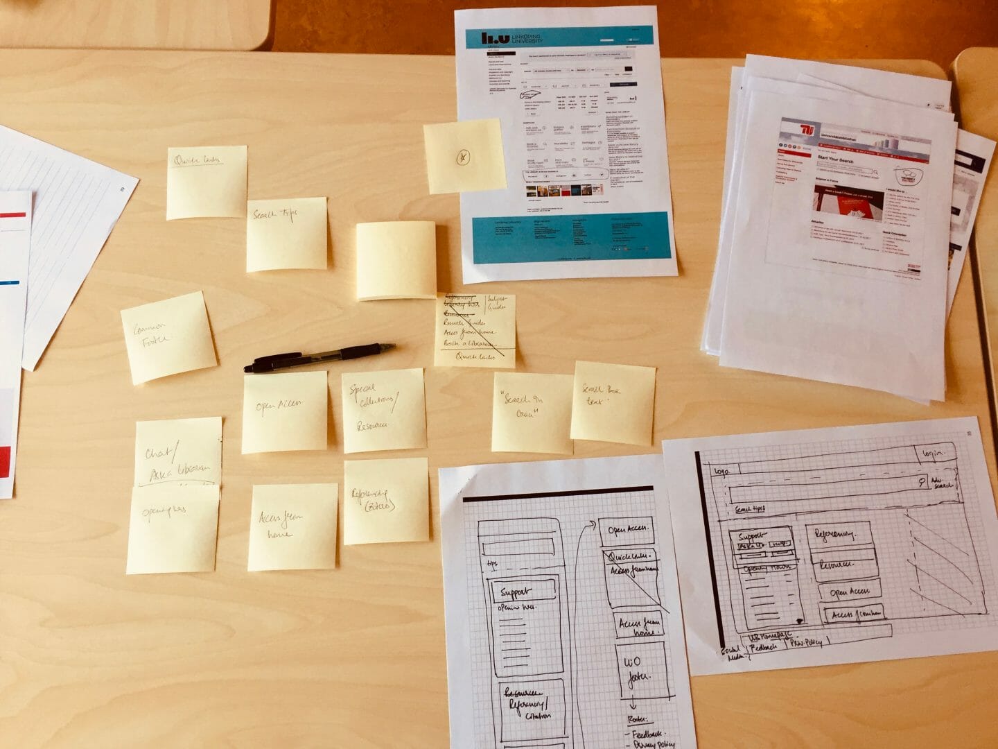
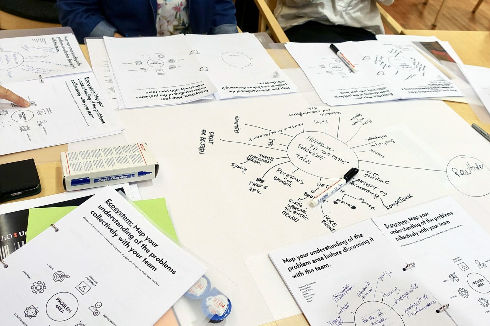
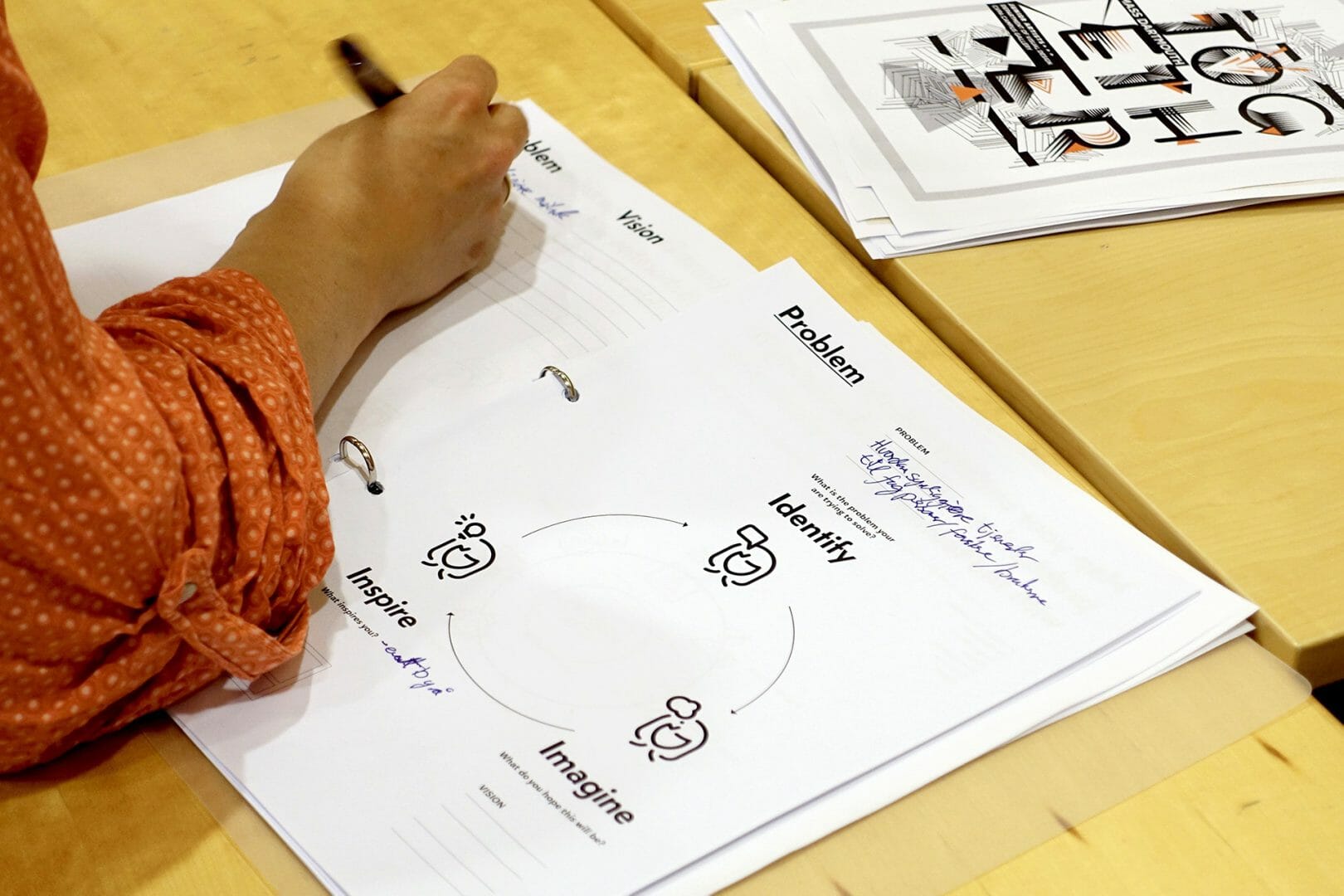
We conceived a workbook that the participants could work through during the course of a Flex workshop and eventually in real world projects as well. A workbook format affords adaptability since it is designed to be written in, sketched on, and modified. Over the course of a project or workshop, the workbook could serve as a living record of learning, thought, and reflections. It would enable librarians to improvise, adapt, and personalise the methods, and consequently develop an understanding of the design approach in the context of their own work. So, we felt that it would be a concrete and tangible takeaway that could be helpful for the LibraryUX workshop participants for reflecting on their learnings and ideas. But at the same time, we wanted to make sure that the workbook, in keeping with the LibraryUX approach, was designed to be open, participatory, and improvisational rather than overly directive and prescriptive.
03/
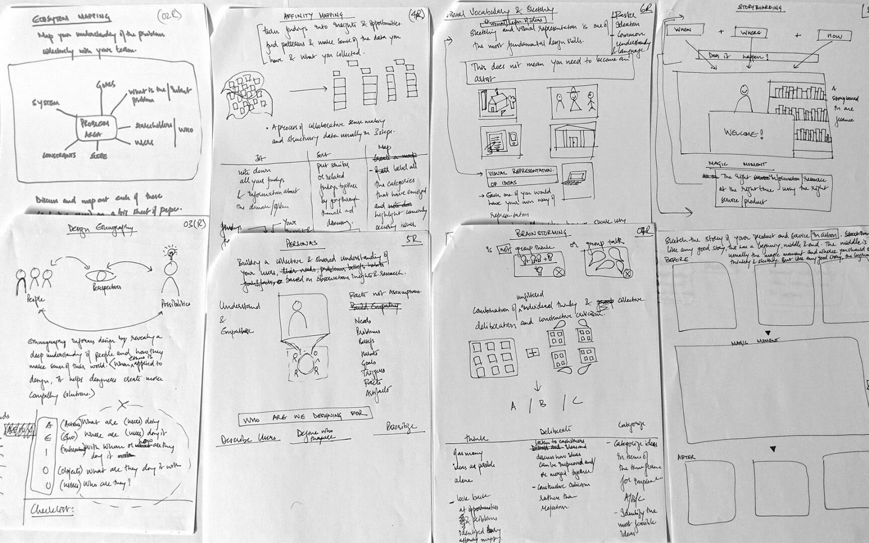
Workbook content sketches
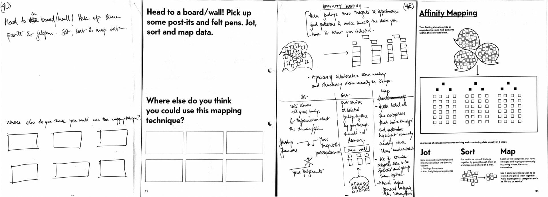
Workbook content sketches and the final page designs
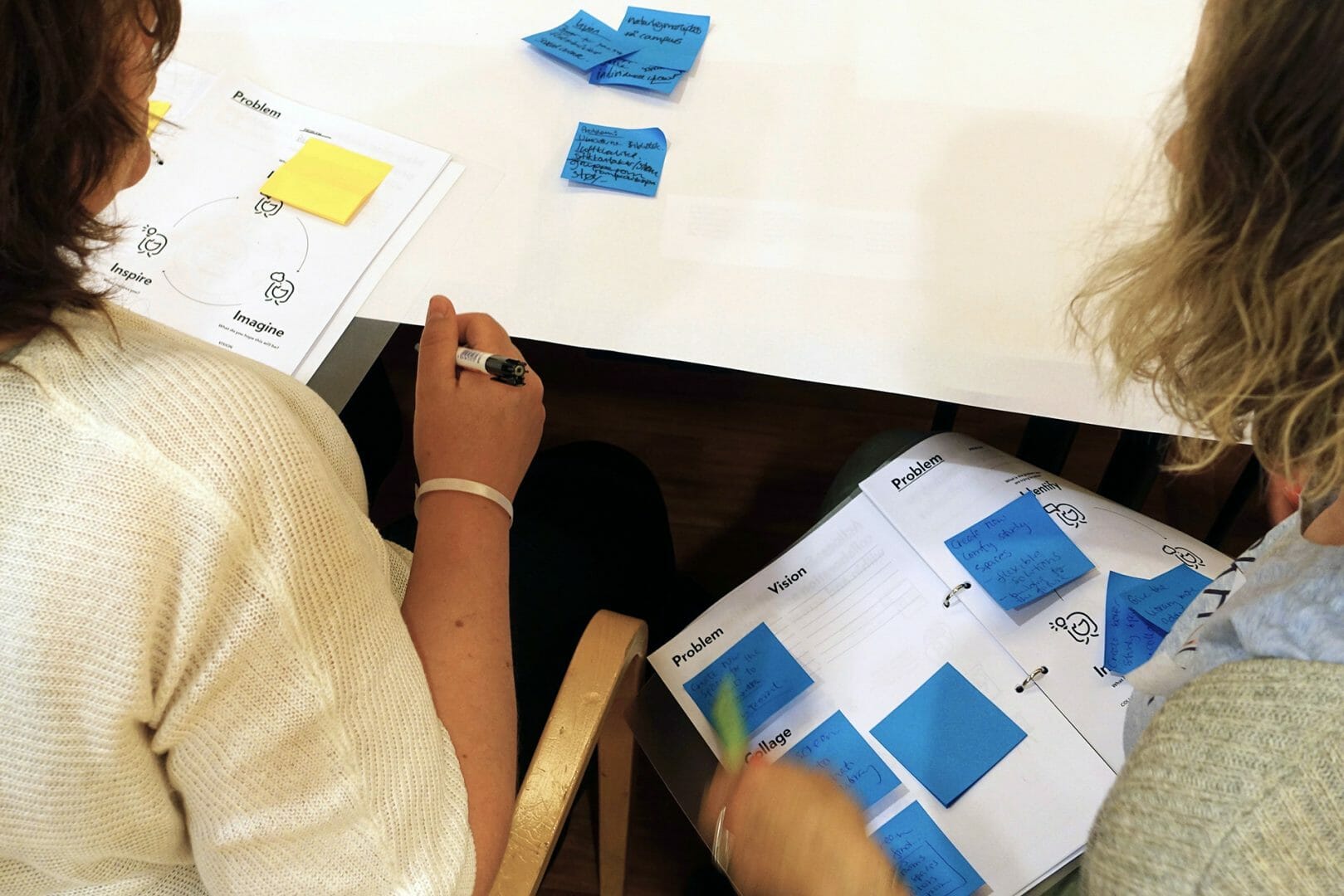
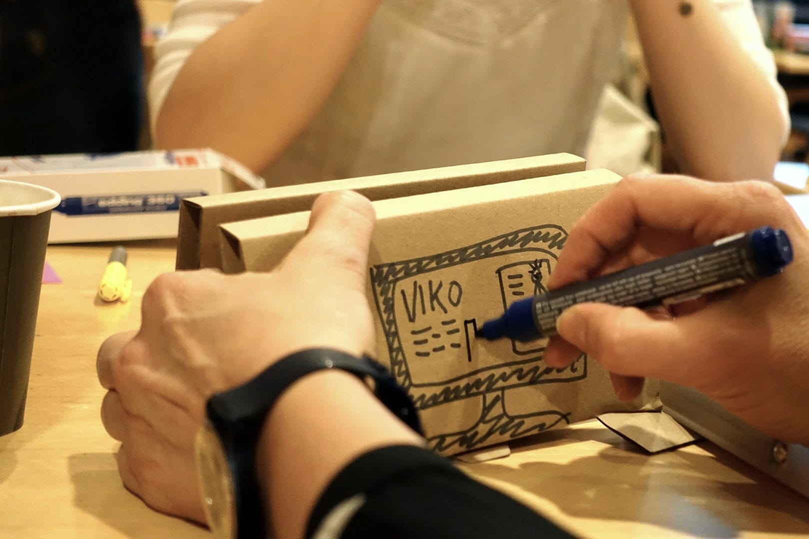
The workbook, called Flexbook, was intentionally designed in black and white to allow for ease of printing, copying, and production. Its content was collaboratively created and iterated over after some internal tests with librarians who were not a part of the team. The layout and identity of the Flexbook was done by Sanjay. In line with the design approach, the structure of the workbook was also kept semi-structured, with even pages left almost empty or with minimal markings for the participants to sketch, note, reflect, and build on their thoughts.
Testing the workbook with the library staff on a real-world project
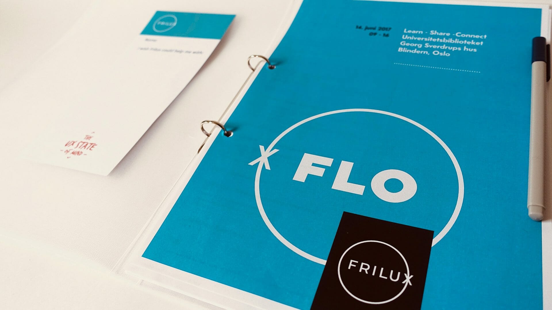
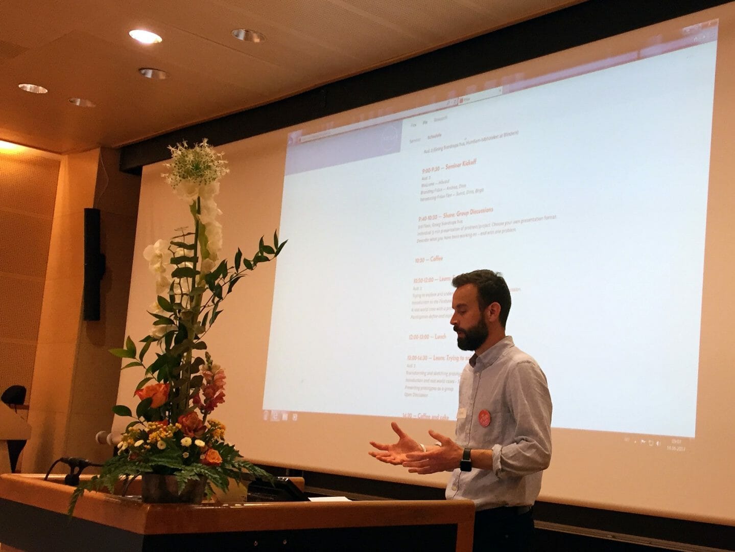
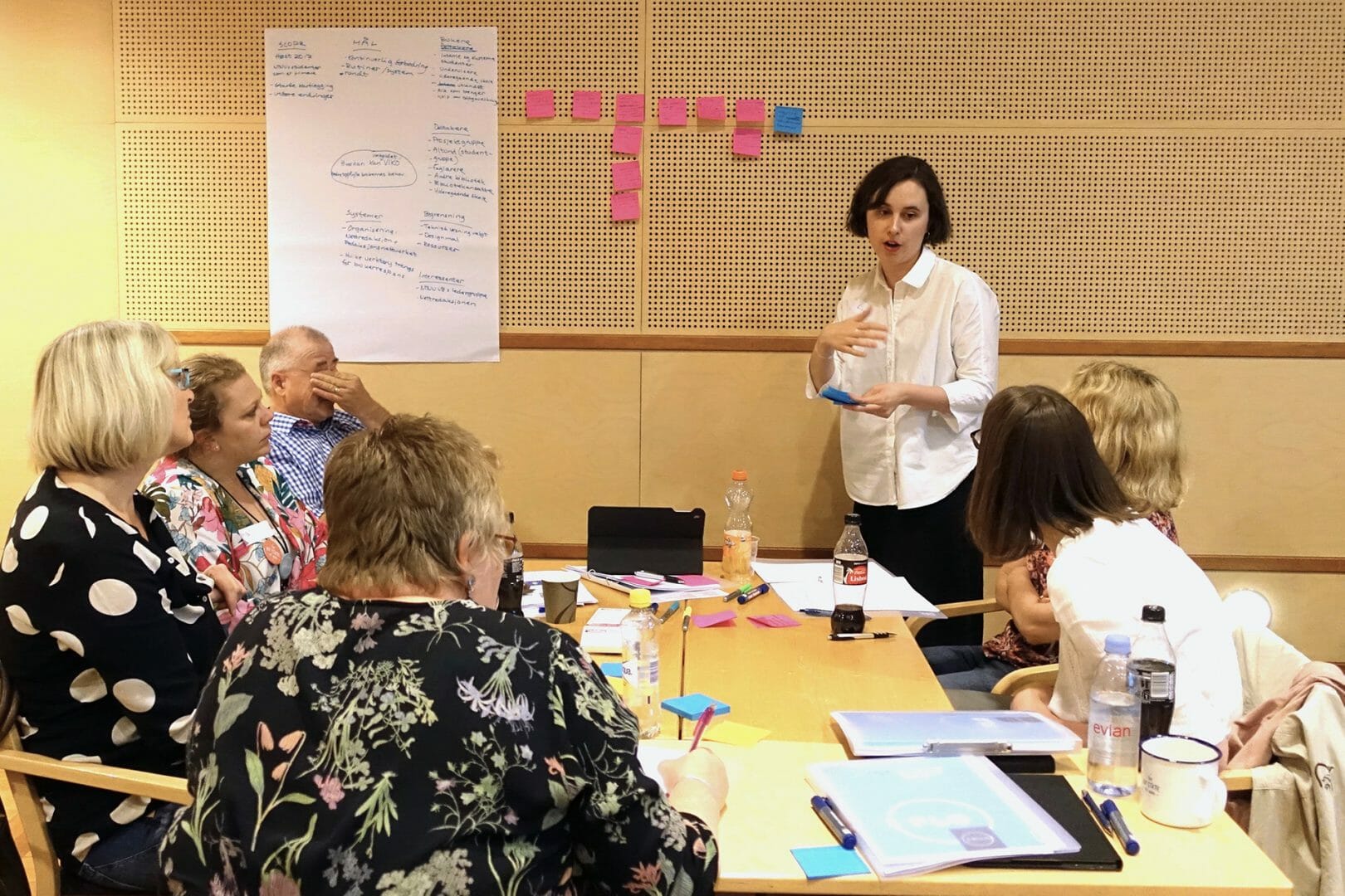
The team also conceptualised Flo as a recurring seminar series which would act as a platform for discussing experiences with the use of the design approach in the context of participants’ practice, while also creating a space for discussing and deliberating over general experiences and issues that libraries faced while designing services.
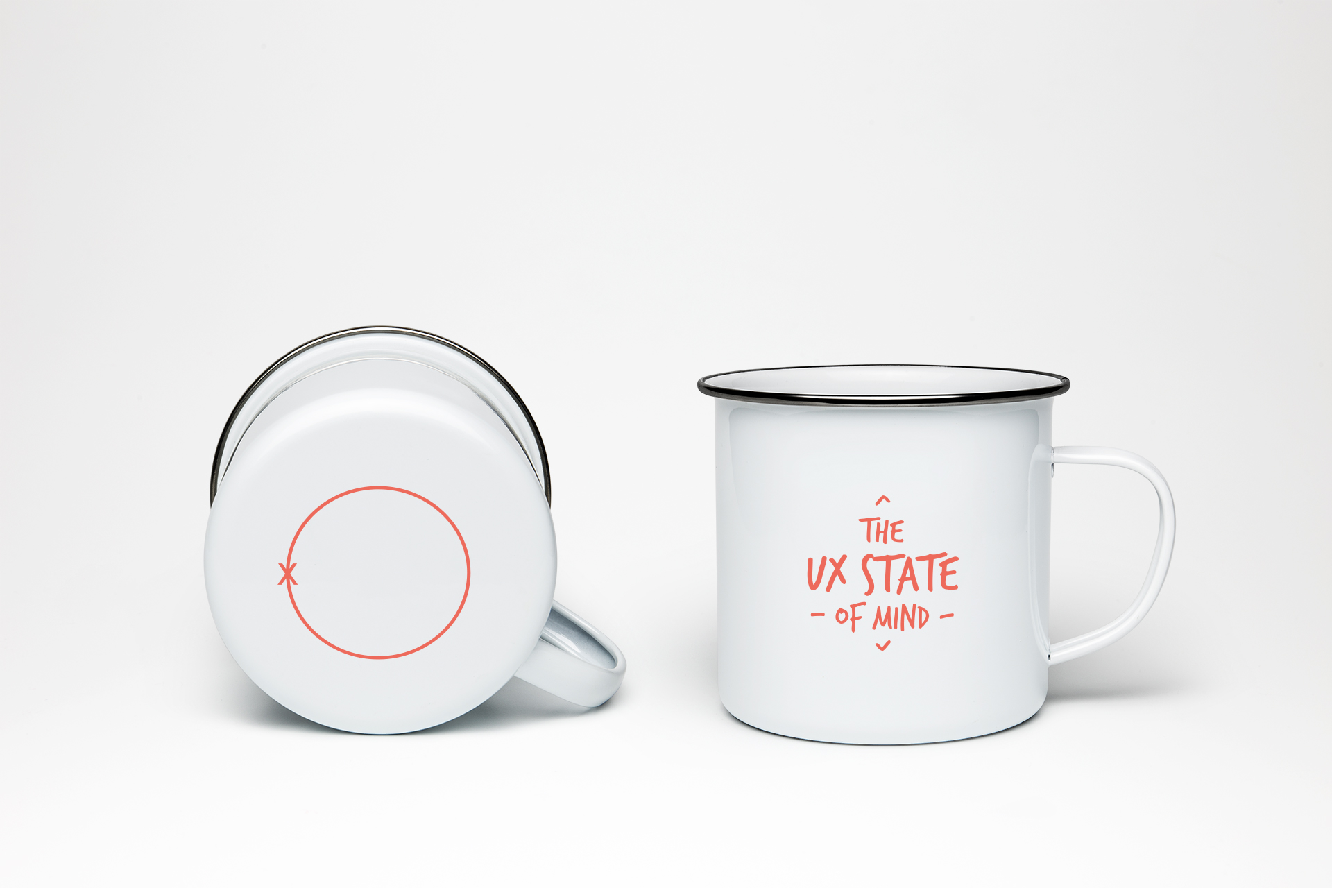
In addition, Sanjay also designed touchpoints such as posters, badges, and mugs could also help spread the word about the design approach and workshop methodology within the regional libraries.
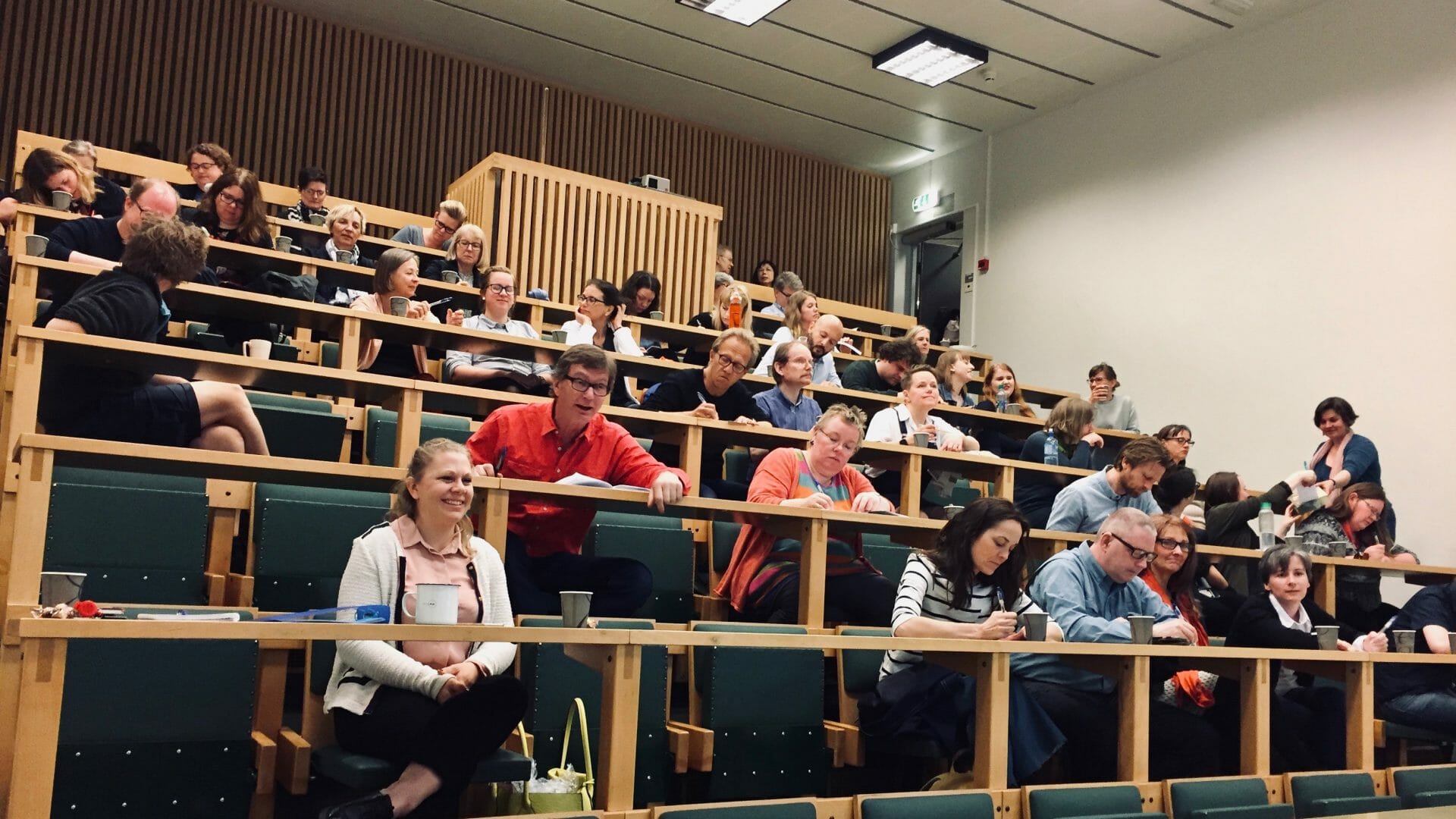
Soft launch of the Frilux brand at the UiO Library
The Flexbook
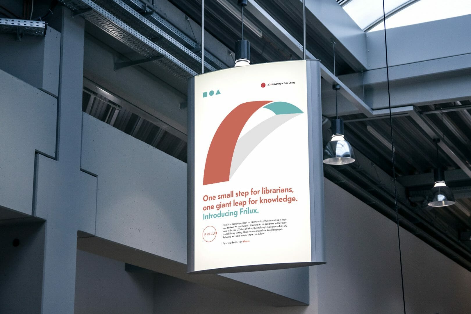
The poster for Frilux Flo
Impact
From Frilux to Frilux-ing
Frilux has become a part of the library’s vocabulary and practice. Librarians at the university use ‘Friluxing’, synonymously with designing.
During an interview after the project, one of the librarians from the LibraryUX team mentioned:
“Suddenly, three weeks later, I was teaching eco-system mapping to the law library, because by then I had done it twice myself. I have been Friluxing with the law library.”
Another member of the team pointed out that:
“Frilux gives more confidence in our abilities to talk about design and use [design]. I thought I could not meaningfully contribute in the UX forum in another department at the university, but I realised their process is very similar even though the methods they use are different.”
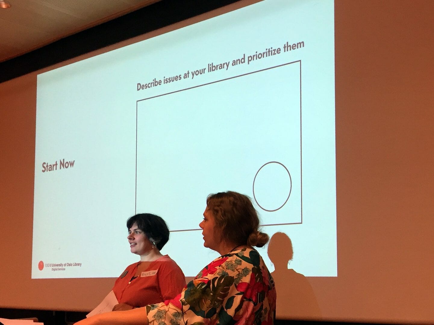
Participant discussions during the Frilux Flo workshop
Finally, both Flex and Flo workshops have been conducted by the LibraryUX team without any assistance from me or other expert designers, and Frilux is managed and developed constantly by the library on its own. One of the leaders of the library commented on the change in thinking and perception of design that Frilux had created, and the transition from an expert-led to a librarian-led approach to design at the library:
“We were sort of the experts earlier (while conducting workshops). Now we have a lot of people from the science library and a few from the humanities, and if they build further on their issues and bring that into their local projects, then we could start to see an organic growth of the mind-set. It’s difficult to say, ‘You should do it.’ But if someone just takes it on their own… then it’s more powerful and it can have a more lasting effect.”
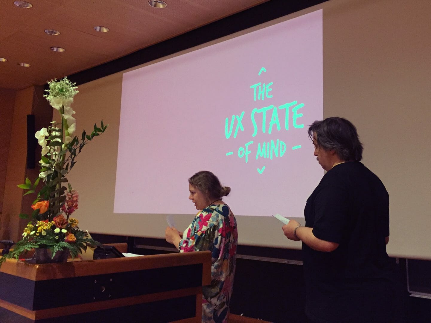
The Frilux brand being introduced during the inaugural Frilux Flo workshop by senior staff members of the digital services department at the UiO Library
FRilux flo, Inaugural Edition, 14 June 2017
FRilux flo, Inaugural Edition, 14 June 2017
Publication
I discussed the process and outcomes from the Frilux project in a peer-reviewed research paper that was presented at the Design Research Society 2018 conference in Limerick, Ireland. The paper was presented as a part of the track How Organisations Employ Design as Vehicle for Change.
Research Paper:
Pandey, S. (2018). Entangling, Oscillating, Frilux-ing: Branding the art of design. Proceedings of DRS 2018 International Conference: Catalyst, 7, 3048–3064. https://doi.org/10.21606/dma.2018.540
More Projects
Versa Networks - Software Defined Network (SDN) Application0 to 1 product design for a SDN management application
D+H India - Transaction Banking App0 to 1 design of a responsive transaction banking app
LibraryUXIntroducing and Positioning Design for the University of Oslo Library
IBM Cloud Storage ManagementRe-designing the cloud object storage application to seamlessly manage and monitor large-scale storage clusters
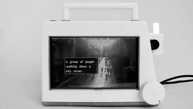
EyespyTVProbing smart surveillance through a portable TV and cultural probes
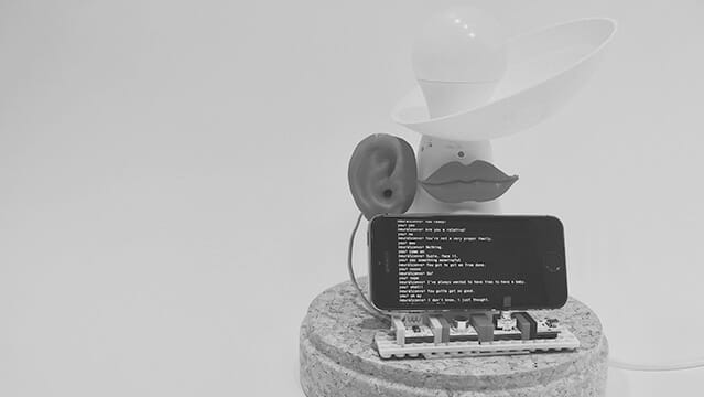
HearsayA voice-enabled lamp that is ‘always in conversation’
TibloDesigning an open-ended and tangible learning aid for young children with dyslexia
NeuralA fictional technology magazine from 2025
EyespyInteracting with Smart Surveillance