Kulu
tl;dr
Client
The University of Oslo and The Norwegian Research Council
Role
Freelance engagement carried out together with Swati Srivastava.
Concept Design • Synthesis • Information Architecture • Detailed Interaction Design
Timeframe
November 2014 – January 2015
Brief
To design an app for teenagers with chronic health challenges for helping them feel in control of their routines and wellbeing and enabling them to better manage their time and express their moods and emotions on a day to day level.
To design an app for teenagers with chronic health challenges for helping them feel in control of their routines and wellbeing and enabling them to better manage their time and express their moods and emotions on a day to day level.
Outcome
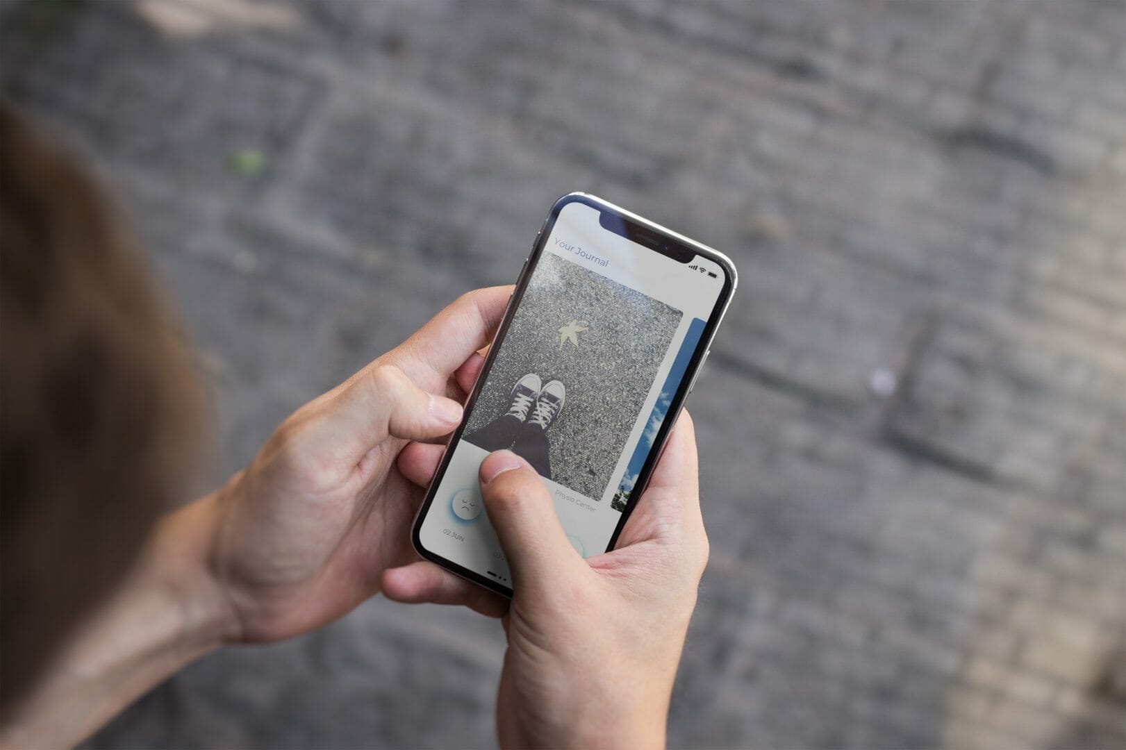
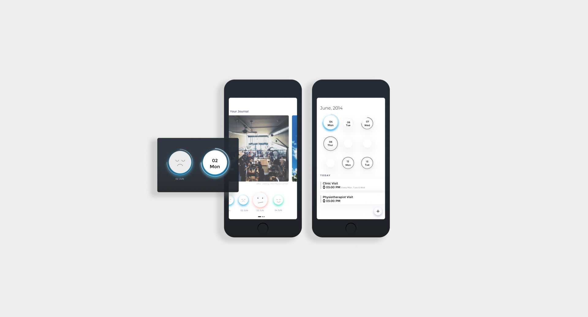
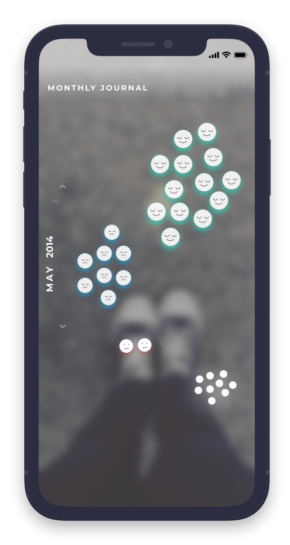
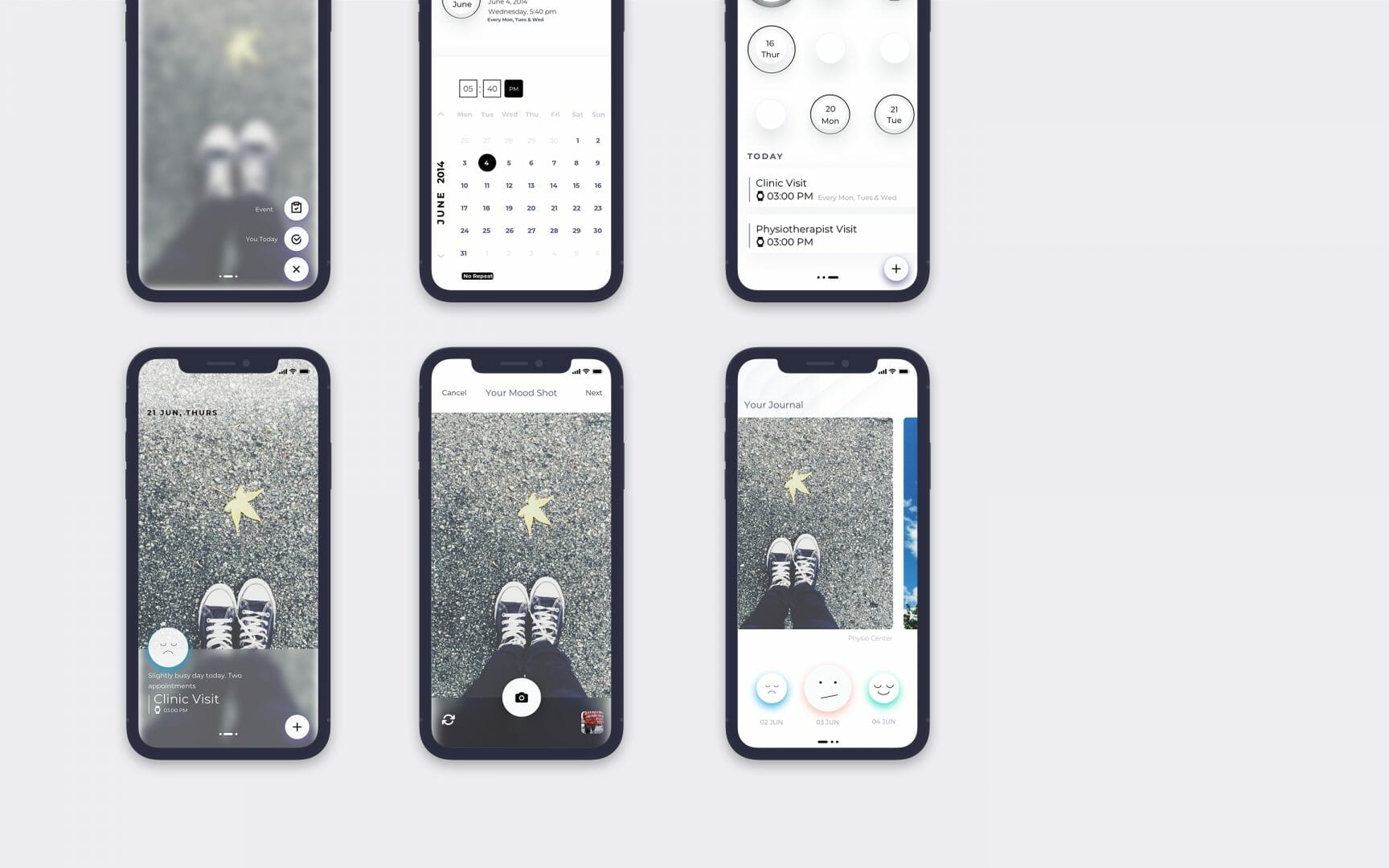
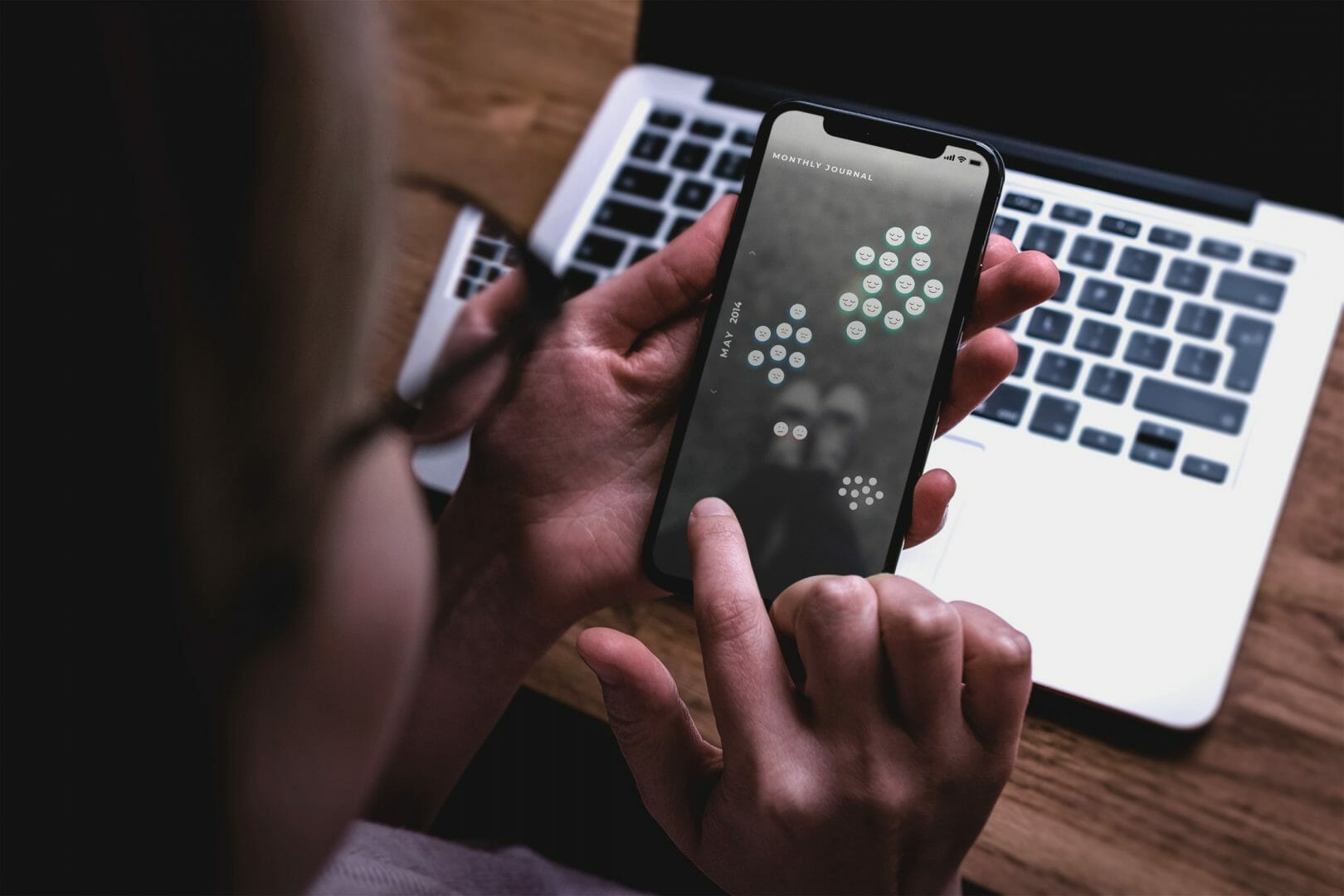
The Kulu app enables teenagers with chronic health challenges, express their moods by taking images and tagging them with their moods and emotions at that time. It also creates a visual map of the tagged moods, helping teenagers reflect on how their feelings and emotions have been in the past.
The app also helps teens manage their day by tracking appointments and supporting them during their transition from paediatrics to adult medicine.
Brief
Helping teens with chronic illness understand, reflect, and improve their personal wellbeing.
This project was a part of a larger research collaboration between the Norwegian Research Council, the University of Oslo, and the Youth Council at Akershus University Hospital. As a part of this project, the research team at the Design Group at the University of Oslo reached out to Swati Srivastava and me to conceptualise and design an app for young people with chronic health challenges. The app was meant to help teens understand and track their moods and stay on top of their appointments, medicine routines, questions, and the potentially confusing and stressful transition from paediatrics to adult medicine.
What I did
Project Management
Milestone Planning
Collaboration
Communication
Consistent Handoffs (for UI/backend development)
Strategy
Concept Design
App definition
Design
Information Architecture
User Flows
Interaction strategy
Detailed wireframes
Prototypes
Role: Interaction Designer (Freelance)
I worked with Swati Srivastava on this project. While we contributed to all aspects of the app design, my responsibilities were focused more on the app’s concept, information, and interaction design.
Core Challenge
Create a seamless bridge between rigid and fluid data points
One the one hand, medical appointments are rigid, specific and time-bound, whereas, on the other, moods are tacit and subjective. This contrast had to be resolved through the design. Also, since the app was meant for teenagers, it needed a fresh and engaging tone and design language, even though creating calendar events, checklists, and so on, can often feel tedious.
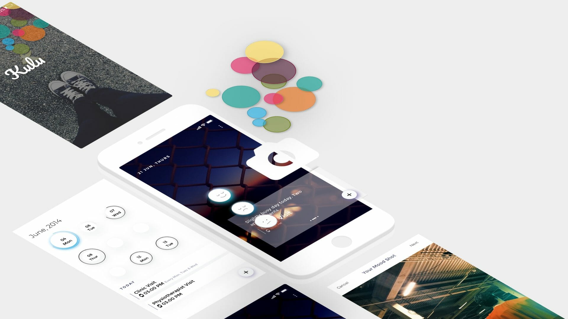
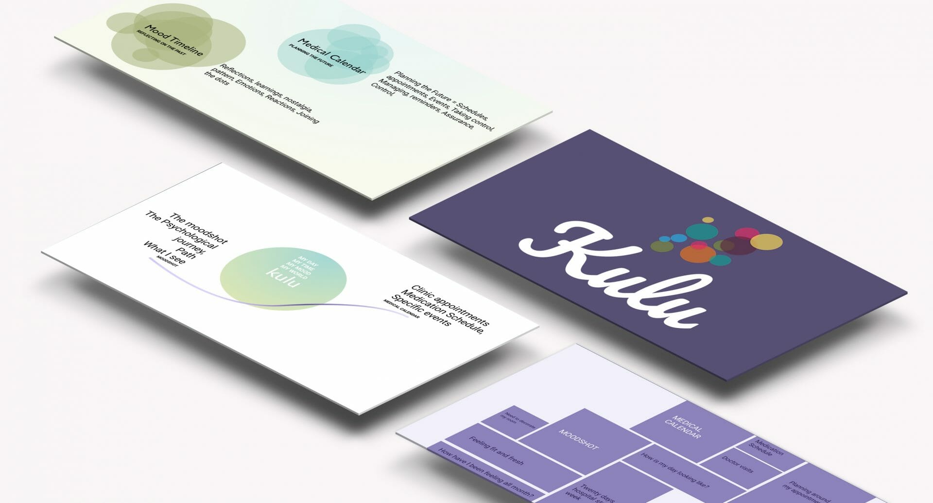
The Kulu App
Kulu is a personal tracking app designed to support young people with chronic health challenges. The app has three main features:
- a moodmap: for tracking and visualising a young person’s moods over time.
- a calendar: for tracking appointments and events connected to their life as a patient.
- transition checklists: implemented at Akershus University Hospital to help them during their transition from paediatrics to adult medicine.
We tackled the challenge of bridging rigid and fluid data points by keeping the mood and calendar views separate, while also contextually bringing in hints from each section into the other. Finally, the home screen consisted of a complete picture of the day with an emphasis on personal wellbeing through images and visualisations and hints of upcoming appointments and notes.
The app does not impose a purely positive picture of the teens’ lives. Instead, it attempts to create a truly personal space where both good and bad memories and emotions can be represented.
Approach
Research ←→ Design
discovery and brainstorming
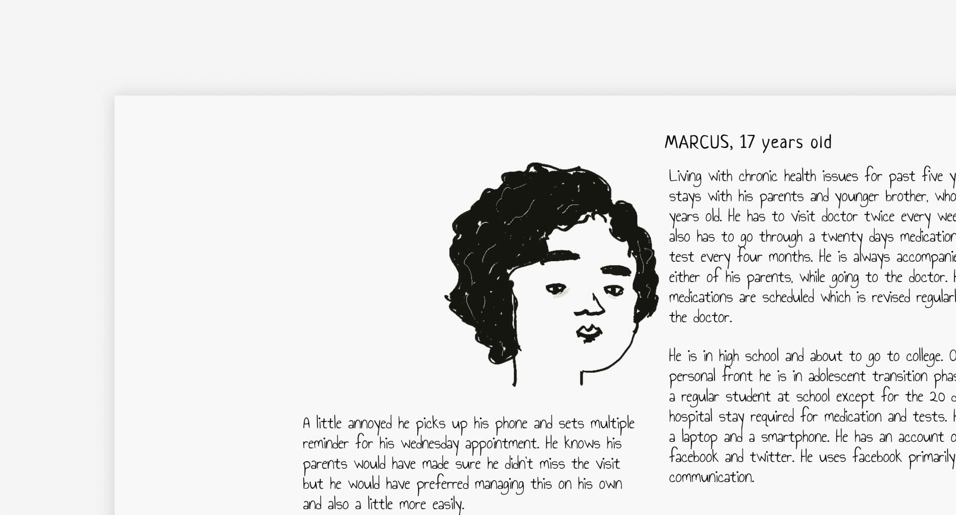
Our approach was one where research and design constantly and rapidly informed one another. We began by reviewing the insights and coded interview data that the research team had previously collected in collaboration with the Youth Council at Akershus University Hospital. We mapped the insights and quotes from the interviews to outline and map the user intents behind tracking and the potential use of this application for them.
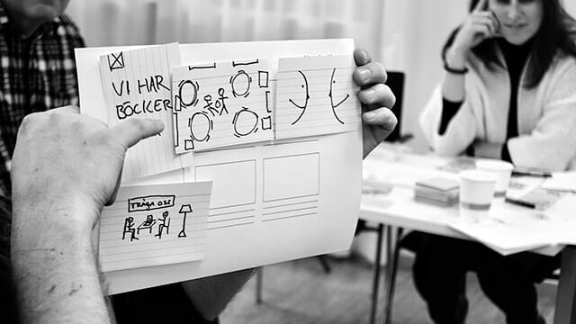
However, as we were consulting on the project remotely from India, we had no direct access to the users. As a result, we were dependent on the research team from the University to involve the users during the design process. We created visuals depicting the condensed form of our understanding to share with the users and the team during co-design workshops that were happening at the hospital in parallel.
01/
Concept map
Persona
These discussions and our insights formed the basis the information architecture, and user flows for the application. We iterated over these flows based on feedback from the co-design workshops before finalising the design.
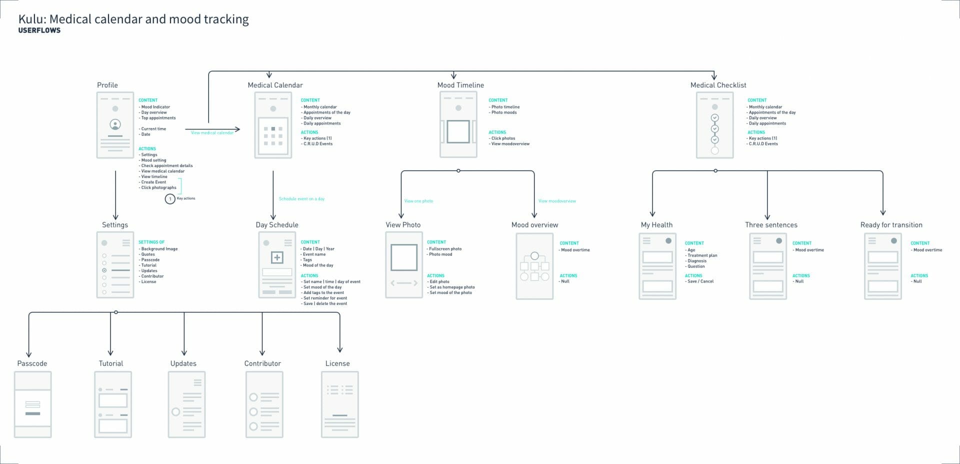
User flows
conceptual framing
Based on the research insights and feedback, we identified the tone and conceptual core of the app. We conceptualised time as the central variable that the app would allow the user to engage with – representing the past through moods and the future through the calendar. Rather than explicitly focus on efficiency and optimising time, we wanted to help users understand their wellbeing and feel more in control over their time.
02/
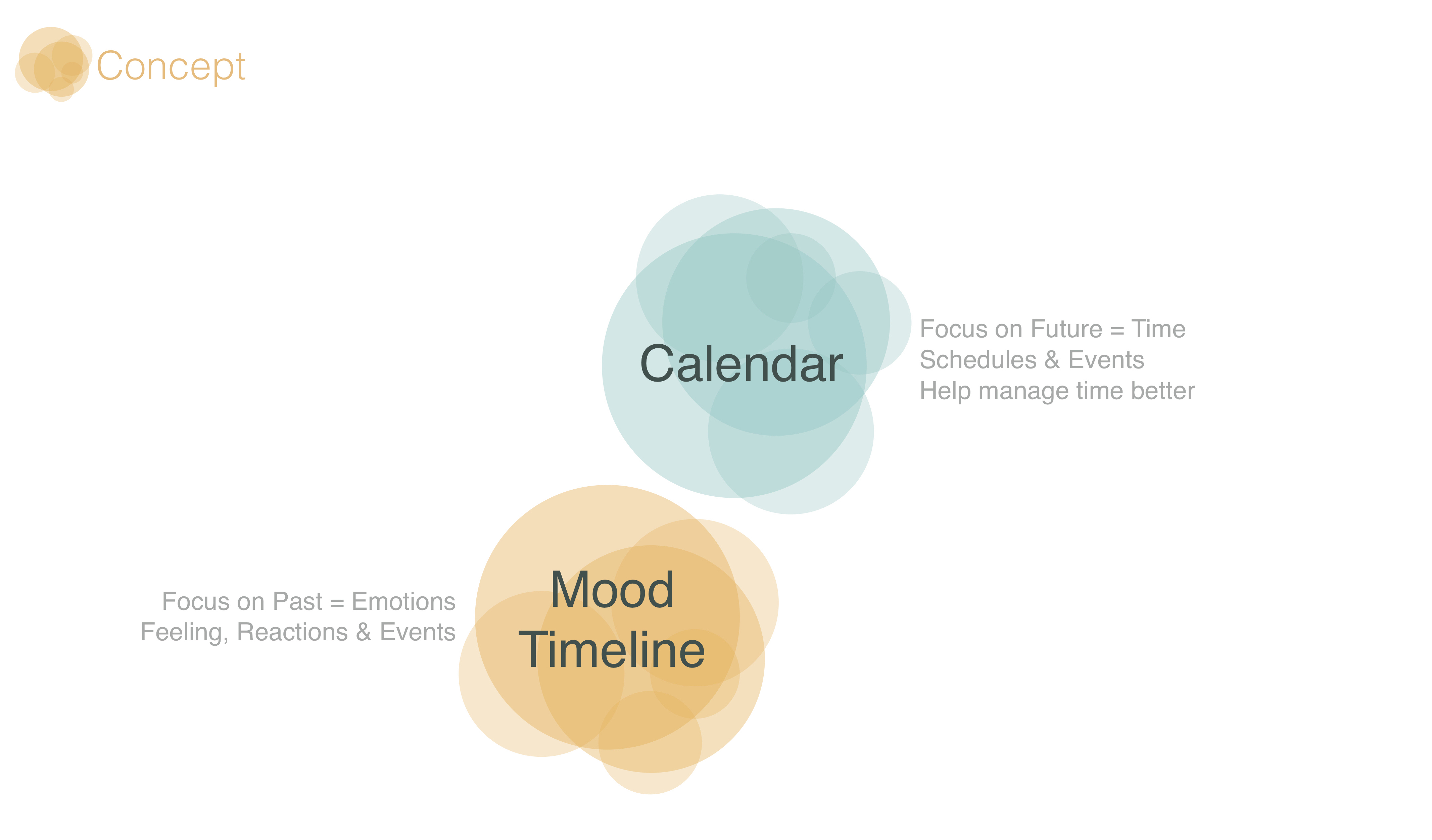
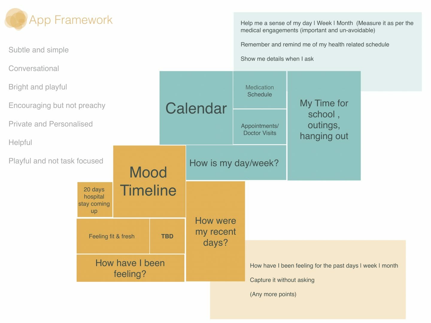
Conceptual frame and proposed app framework
Detailed Design
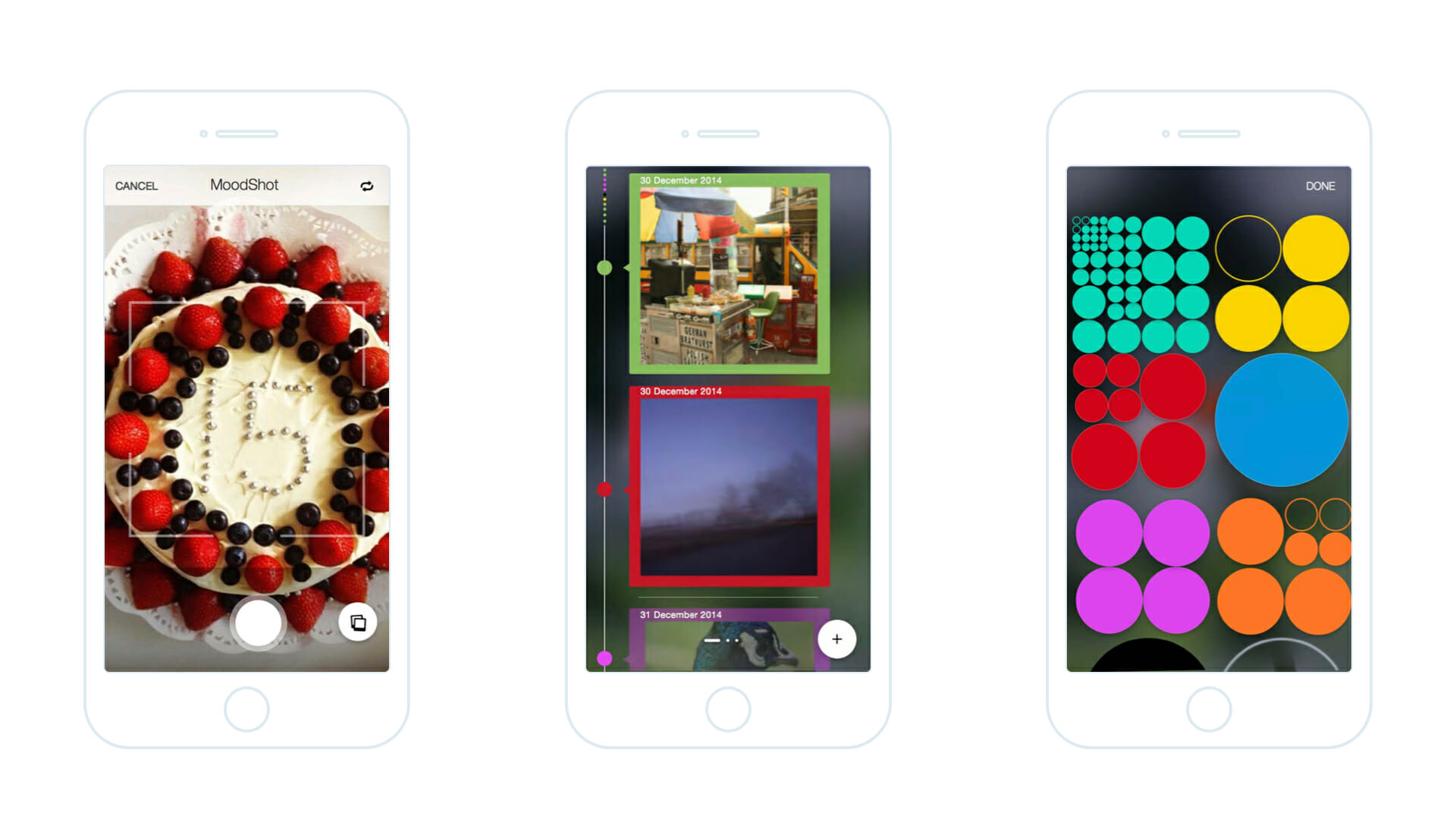
We conceived a series of design elements for tracking and visualising the user’s mood. These elements helped the user associate both their positive and negative moods with an image that highlighted what the user noticed and registered in the following ways:
- a single point in time – a Moodshot
- over the course of a day – the Moodline
- over a period of time – the Moodmap
The user could choose to click a picture representing their day or mood or a moment and add the simple colour-based mood emoticons to create a Moodshot. The app allowed for colour personalisation as well.
03/
Wireframe mockups
We adopted a similar zoom-in and zoom-out interaction for the calendar section as well, where the user could view just the calendar, or a list of appointments, or a hybrid view that split between the two.
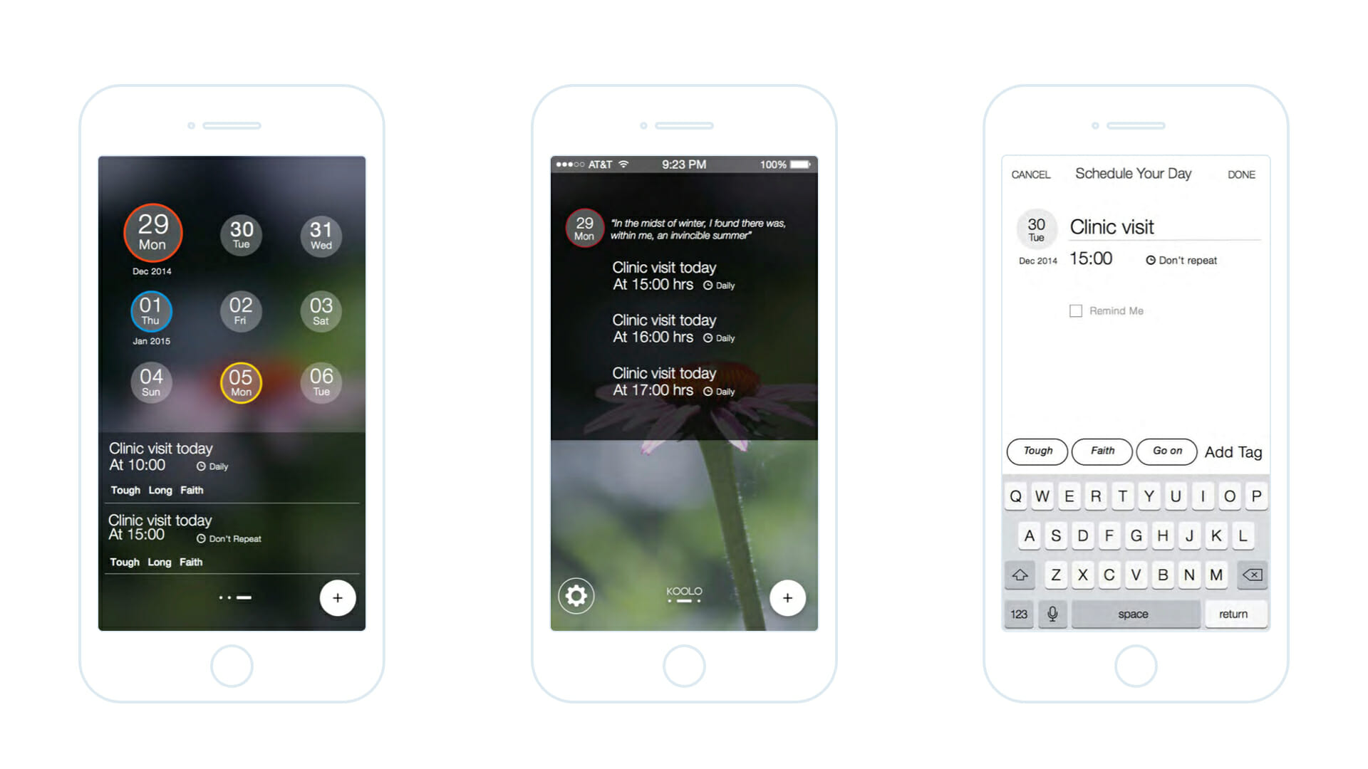
Wireframe mockups
Using these design elements and the user flow identified earlier, we created detailed wireframes and flows. We also created pixel-perfect visually-rendered screens for the research team to evaluate during the ongoing co-design workshops and subsequently for the development of the app. We focused on creating a simple, and subtle design language using the metaphor of a conversational and personal companion.
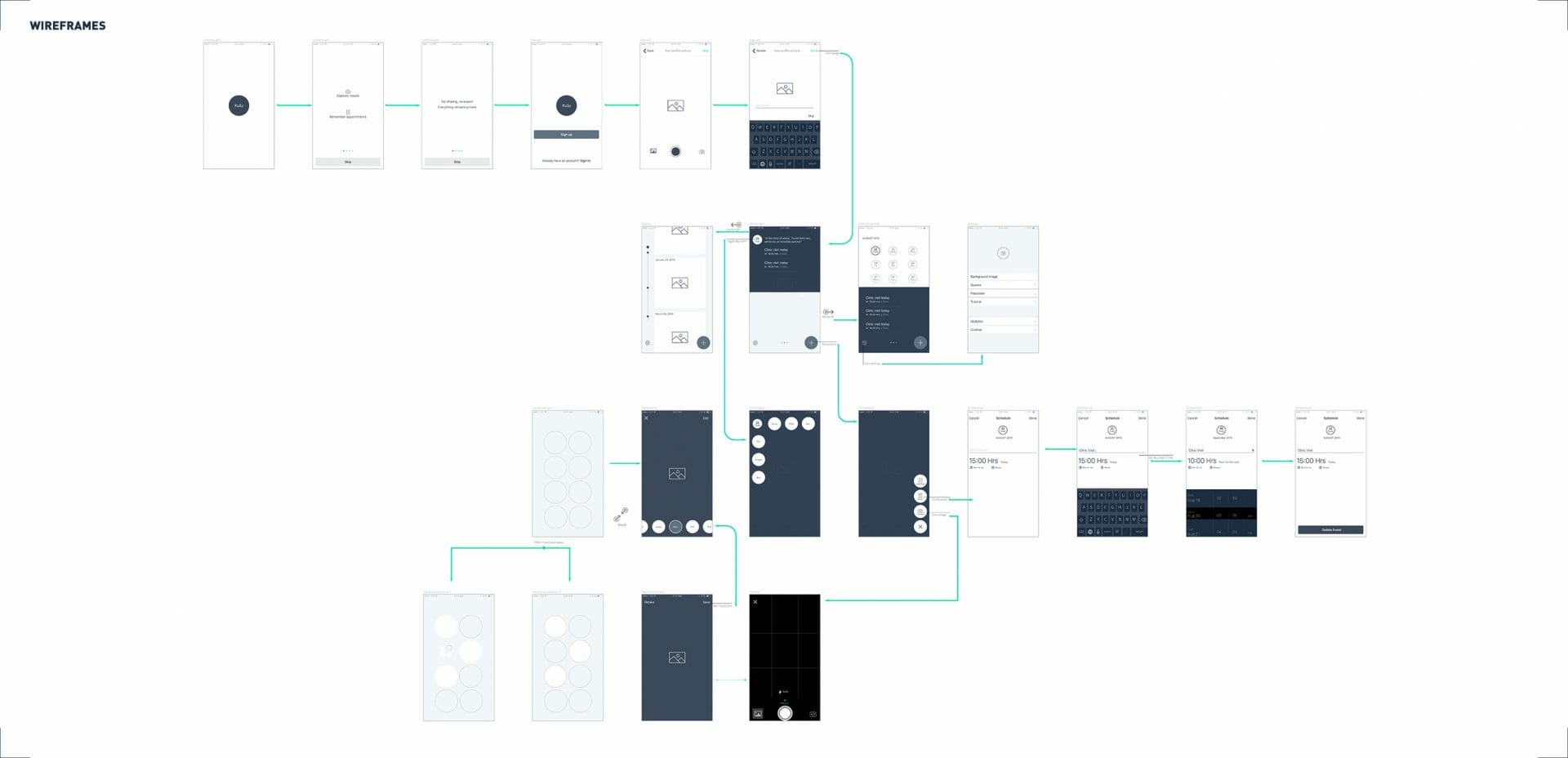
Wireframe mockup flows
More Projects
Software Defined Network Management ApplicationEnd-to-end design of a v1.0 product for a stealth mode startup (name confidential)
Transaction Banking AppResponsive design and prototype for an app for a leading fintech company (name confidential)
LibraryUXIntroducing and Positioning Design for the University of Oslo Library

FriluxBranding Design at the University of Oslo Library
Enterprise Cloud Storage Management ApplicationRe-designing the application (name confidential) to seamlessly manage and monitor large-scale storage clusters
TibloDesigning an open-ended and tangible learning aid for young children with dyslexia
EyespyTVProbing smart surveillance through a portable TV and cultural probes
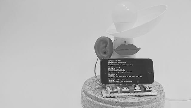
HearsayA voice-enabled lamp that is ‘always in conversation’
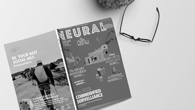
NeuralA fictional technology magazine from 2025
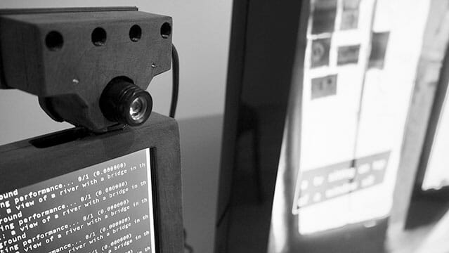
EyespyInteracting with Smart Surveillance